Interpreting data is about more than just reading numbers—it's about understanding what those numbers actually mean. The real value comes from seeing the story behind the data, spotting patterns that matter, and avoiding the trap of finding meaning where there is none. This skill is useful whether you’re looking at survey results, academic performance, or trends in campus activities.
Our brains are wired to find patterns, but sometimes we see connections that aren’t really there. The key is to consider patterns, trends and outliers when analyzing data to make a decision:
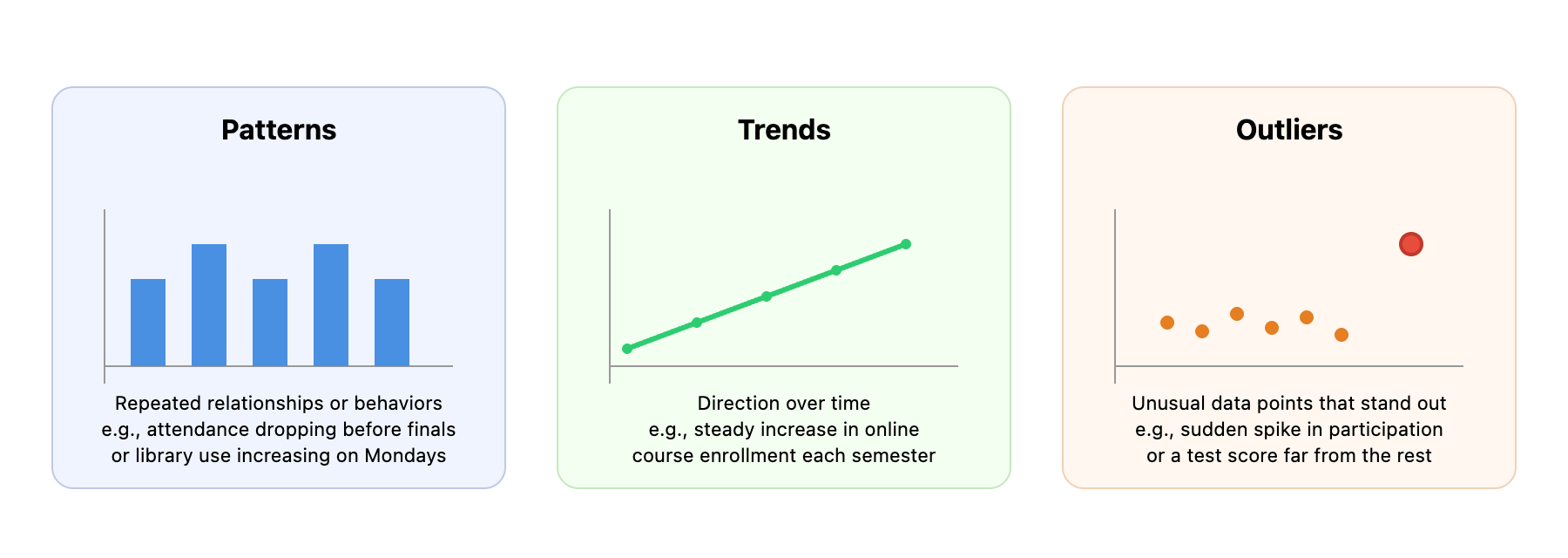
Start by figuring out what “normal” looks like. In other words, what are the consistent patterns? For example, if club meeting attendance usually ranges from 20 to 30 people, a meeting with 50 attendees is an outlier worth investigating. But a meeting with 22 is just normal variation. Use averages, ranges, and distributions to set your baseline before looking for deeper meaning.
Trends need enough time to be meaningful. If you see a jump in grades for one week, ask, "Is this just a fluke, or does it continue over several weeks or terms?" Real trends persist across multiple periods and show a consistent direction. If someone says, "Our participation is up 20% this week," your response should be, "How does this compare to last month or last year?" This helps you avoid mistaking a temporary spike for a real change.
Outliers should always be checked for errors first—maybe someone entered the wrong number. If the outlier is real, ask, "What was different this time?" or "Can we repeat what worked well?" Outliers can reveal problems to fix or opportunities to build on.
Visuals like line graphs or bar charts make it easier to spot patterns and trends. Just be careful with how charts are scaled—sometimes a graph can make small changes look big, or big changes look small. Always check the axes and labels to make sure you’re seeing the real story, not a distorted one.
Numbers don’t exist in a vacuum. The same pattern can mean different things depending on what else is happening.
- Timing matters. For example, a drop in gym attendance during exam week is normal, not a sign of a problem. Comparing November to October might not make sense if there are seasonal effects. The data will tell a clearer picture if you compare November to last November instead.
- External events can explain changes. If campus Wi-Fi usage drops during a major holiday, it’s probably because fewer people are on campus. Economic changes, weather, or even a big sports event can all affect your data.
- Internal changes also matter. If a new registration system is launched, a temporary dip in sign-ups might just mean people are adjusting. Policy changes, new programs, or staff changes can all shift the numbers.
Here’s how context changes interpretation:
- Ryan: I’m worried—our tutoring sessions dropped from 40 to 20 last month.
- Jessica: That sounds like a big drop. Did anything change last month?
- Ryan: Actually, yes. The main exam period ended, so fewer students needed help.
- Jessica: So the drop is expected after exams, not a sign that something’s wrong.
Or consider this: "Our error rate went up from 2% to 8%." That sounds bad, but if you just started tracking errors more carefully, the increase might mean you’re catching more issues, not making more mistakes. If you learn that other universities average 12% error rates, your 8% might actually be a sign of good performance.
To get the full picture, talk to people involved—students, staff, or faculty. They can explain changes that the numbers alone can’t. Building these connections helps you understand what’s really going on and avoid misinterpretation.
Every dataset has both signal (real information) and noise (random variation). It’s easy to mistake noise for something important.
- Sample size matters. One bad review doesn’t mean a program is failing, but a dozen similar reviews might. The more data you have, the easier it is to see what’s real.
- Control limits help you know what’s normal. If attendance usually varies by 10%, a 5% drop is just noise. But a 30% drop is a real signal to investigate. These limits come from looking at your historical data.
- Confirmation bias can make you see what you expect. If you think a new policy is working, you might notice every small improvement and ignore setbacks. Ask yourself, "What would convince me I’m wrong?" This helps you stay objective.
Looking at averages over time (like monthly instead of daily numbers) helps smooth out noise and shows real trends. If your data never changes, that’s a red flag—maybe you’re not measuring honestly, or missing important feedback.
Remember, variation is normal and even healthy. If student satisfaction scores never change, maybe you’re not hearing from everyone. If lab results are always identical, maybe something is wrong with the measurement process. Honest data will always have some ups and downs.
In the upcoming exercises, you’ll practice these skills by interpreting a real-world dataset. You’ll identify patterns, provide context, and decide what’s signal and what’s just noise. The goal is to move beyond just reporting numbers and start making sense of what they mean—so you can make better decisions, whether you’re working on a group project, running a campus event, or analyzing academic results.
