You've just learned how to systematically explore the Palmer Penguins dataset — examining its structure, calculating statistics, and understanding patterns. Now you're ready to create actual visualizations and ensure they meet professional quality standards. This lesson introduces a powerful workflow: prompt Claude to create a visualization → Claude automatically analyzes the generated image → compare multiple visualizations for consistency. Claude becomes both your visualization creator and your quality critic, examining plots and ensuring consistency across your figures. Let's start creating and validating visualizations!
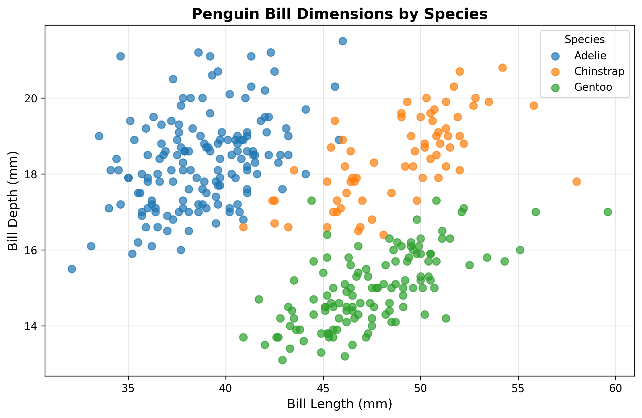
Let's create a scatter plot to visualize the relationship between bill length and bill depth across the three penguin species. This will reveal whether different species have distinct bill proportions.
Claude will read your data, create the visualization, and automatically analyze it:
Notice what just happened: you provided a clear prompt describing what you wanted, and Claude handled the entire workflow — reading the CSV file, writing Python code to create the visualization, executing that code, and automatically providing an analysis of the result. Claude assigned colors to each species (blue for Adelie, orange for Chinstrap, green for Gentoo) and immediately identified the key insight that species form distinct clusters with different bill proportions.
The resulting visualization reveals the distinct clustering patterns Claude described. The three species occupy different regions of the plot, showing that bill proportions — not just overall size — vary systematically between species:
When Claude creates a visualization, it automatically examines the resulting image and provides initial feedback. This happens without you needing to explicitly request it. Claude checks that the plot was created successfully, describes what the visualization shows (axis labels, colors, patterns), and identifies key insights visible in the data.
This automatic analysis serves as your first quality check — confirming that the plot generated correctly and that it shows meaningful patterns. However, you can also request more detailed analysis or use Claude's Read tool to compare multiple visualizations for consistency.
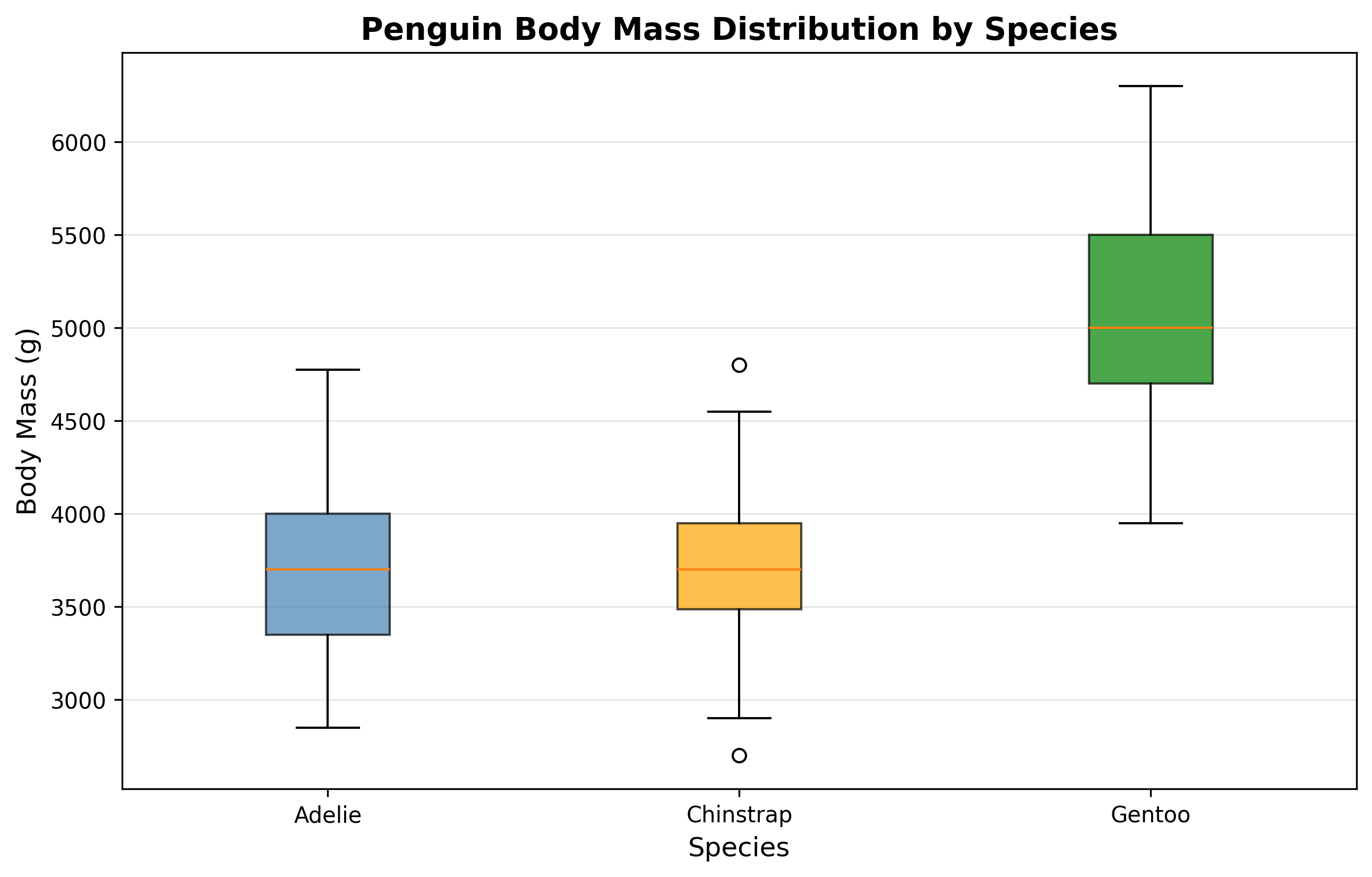
Let's create a different type of plot to explore another aspect of the data. Box plots are excellent for comparing distributions across groups, so let's visualize how body mass differs between the three species.
Claude will create the new visualization and then compare both plots:
This interaction demonstrates a crucial capability: Claude can compare multiple visualizations by reading both images and checking for consistency. When you explicitly asked Claude to look at both plots and compare their color schemes, Claude loaded both images and confirmed that the color-to-species mapping remains consistent, even noting that the exact shades differ slightly while the mapping stays the same.
The box plot shows the body mass distributions Claude analyzed, with each species represented by its assigned color. The boxes show the middle 50% of data (quartiles), the lines inside represent medians, and the whiskers extend to show the full range:
Professional data visualizations require consistency across multiple figures. When creating a series of plots — whether for a report, presentation, or research paper — you need to ensure that colors, fonts, and design choices remain consistent so your audience can easily compare insights across different views of the data.
In this example, maintaining the same color scheme means a reader can instantly connect insights: they see that Gentoo penguins (green) in the box plot are the heaviest, and when they look back at the scatter plot, those same green points in the upper region have longer bills but shallower depth. Without consistent colors, readers would need to constantly check legends and mentally translate between different color schemes.
The fact that Claude automatically maintained this consistency (assigning the same colors to each species in both plots) shows that Claude understands this professional standard. When Claude noted that "the exact shades differ slightly," this demonstrates nuanced analysis — perfect color matching isn't always necessary as long as the mapping (blue = Adelie, orange = Chinstrap, green = Gentoo) stays consistent.
You can explicitly ask Claude to verify consistency across multiple visualizations at any point in your workflow. This is particularly valuable when:
- Creating multiple related plots for a single report or presentation
- Building a series of exploratory visualizations where patterns need to be traceable across different views
- Ensuring that design choices (colors, fonts, axis scales) align with project or publication standards
The pattern is simple: create your visualizations, then ask Claude to read and compare specific aspects. Claude will examine the images and provide structured feedback about what's consistent, what differs, and whether those differences matter for your analytical goals.
You now understand how to create visualizations with Claude and ensure they meet professional quality standards. Simply provide clear prompts describing what you want to visualize, let Claude handle the implementation details, and rely on Claude's automatic analysis to confirm your plots show meaningful patterns. When creating multiple visualizations, explicitly request consistency checks by asking Claude to compare specific aspects like color schemes, fonts, or layout choices. In the upcoming practice exercises, you'll create your own series of penguin dataset visualizations and ensure they maintain professional consistency throughout!
