Be a part of our community of 1M+ users who develop and demonstrate their skills on CodeSignal
Welcome to lesson five of The Binomial Distribution — you are nearly at the finish line, with just one lesson remaining after this. In the previous lesson, you discovered that raising the number of trials n pushes the center of the distribution higher and fans the spread wider. But if you looked closely at those larger bar charts, you might have noticed something we did not discuss: as the bars multiplied and narrowed, the overall outline started to change. It began to look a lot like a shape you have already seen.
This lesson explores that emerging shape. You will see why a binomial distribution with enough trials and a moderate success chance settles into a smooth, symmetric bell — and why a very low or very high success chance can keep the shape stubbornly skewed, even with hundreds of trials.
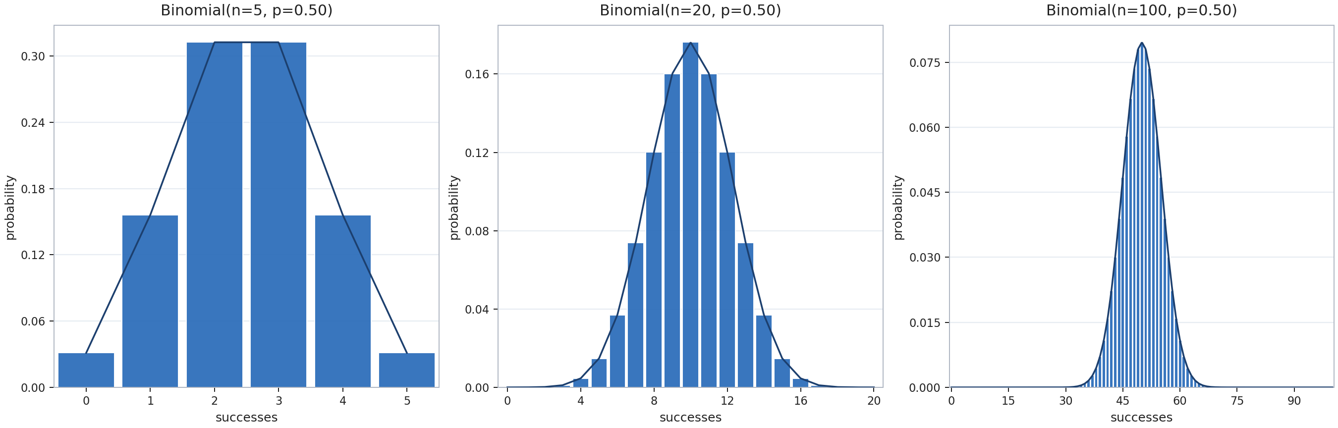
Think back to the bar charts from earlier in this course. With a small number of trials, say n=5, there are only six possible outcomes (0 through 5). The chart has just a handful of bars, and the shape looks blocky and uneven — hard to call a "curve" at all.
Now picture what happens as we increase n to 50 or 100. The number of possible outcomes grows, the bars get narrower, and the gaps between them shrink. If you traced a line across the tops of all those bars, the outline would look like a smooth, flowing curve rather than a staircase.
This smoothing effect is purely a consequence of having more bars packed together. But the shape of that smooth outline — whether it is symmetric and bell-like or lopsided and skewed — depends on something else entirely: the value of p.
When the success probability is moderate, meaning it sits comfortably away from both 0 and 1, something striking happens as n grows. The distribution becomes increasingly symmetric, and its smooth outline settles into the familiar bell shape you studied in the normal distribution course.
Let's watch this unfold with p=0.50:
Trials n
Shape description
5
A short row of bars, roughly symmetric but clearly stepped
20
More bars, smoother outline, visibly symmetric and mound-shaped
100
Many narrow bars forming a smooth, symmetric bell curve
The charts below show this progression side by side:
The same pattern appears for other moderate values of p, such as 0.30 or 0.60. At small n, these might look slightly lopsided, but as n climbs, the skew fades and the bell shape takes over. By the time n reaches several dozen or more, the outline closely resembles a normal distribution.
Why the Bell Shows Up
You may recall from the earlier course on the normal distribution that the bell shape tends to appear whenever an outcome is the result of many small, independent influences adding together. Each trial in a binomial experiment contributes one small, independent piece to the total count: either +1 (success) or +0 (failure). When n is large, the final count is the sum of many such tiny, independent contributions.
This is exactly the recipe that produces a bell curve. No single trial dominates the total. Instead, the count is shaped by the combined effect of dozens or hundreds of small pushes, each equally unpredictable. The randomness averages out in a predictable way, pulling the distribution toward that symmetric, mound-shaped outline.
This connection has a name in mathematics: the normal approximation to the binomial. For large n and moderate p, a binomial distribution with center n×p and spread n×p×(1−p) behaves almost identically to a normal distribution with the same center and spread. It is one of the most elegant bridges in all of probability.
When the Bell Does Not Appear
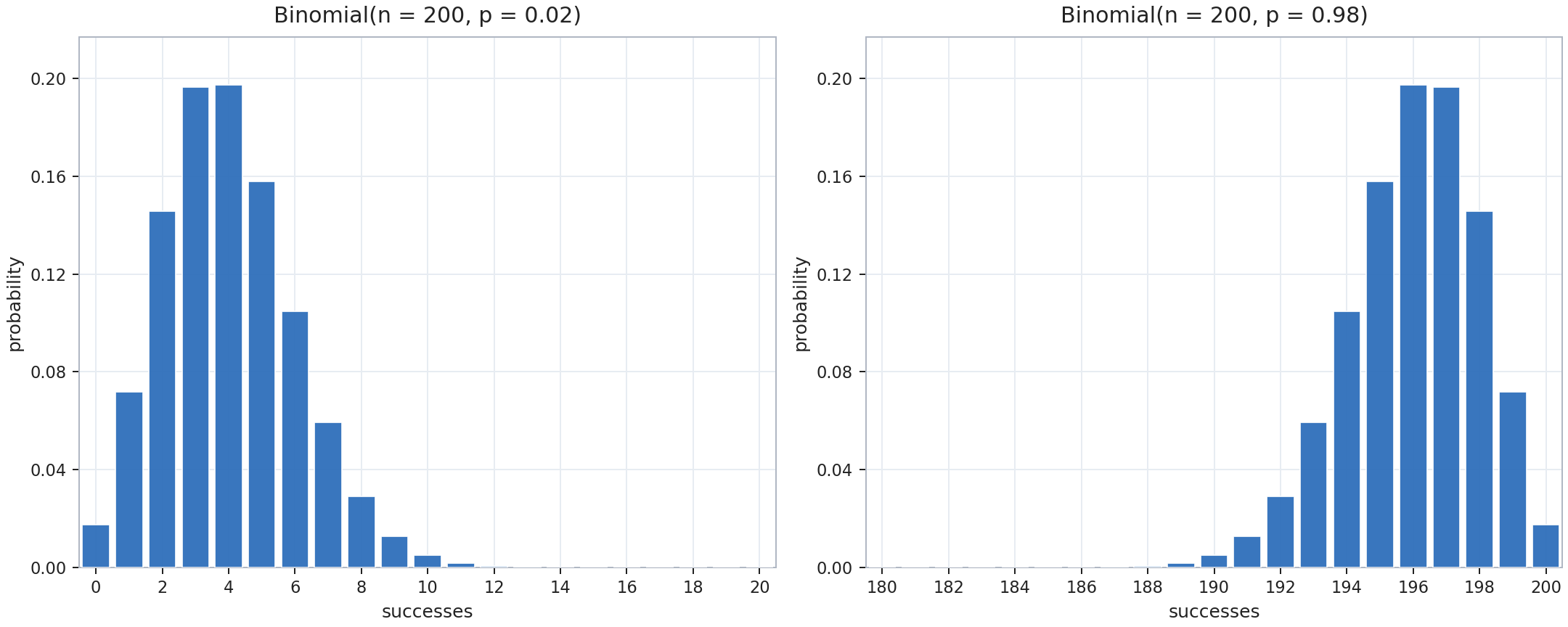
The bell-shape story has an important exception. When p is very low or very high, the distribution can remain skewed even with a large number of trials.
Consider p=0.02 and n=200. The expected number of successes is 200×0.02=4. Most of the probability is packed into a few bars near 0 through 5, with a long, thin tail stretching to the right. Even though n is large, the distribution still looks right-skewed rather than bell-shaped. The same logic applies in reverse: p=0.98 with n=200 would pile the bars near 200 with a left-skewed tail.
Why does extreme p resist the bell? When p is tiny, most trials produce failure, so the count hovers near zero. There is a hard floor at 0: the left side of the distribution gets compressed against that wall while the right side can still stretch out. The asymmetry has no room to balance itself. For the bell to emerge, p needs to be far enough from both 0 and 1 so that the distribution has space to spread evenly on both sides of its peak.
A useful rough guideline: the bell approximation works well when both n×p and n×(1−p) are at least around 10. If either product is very small, expect skew to persist.
Same Survey, Different Shapes
To see both outcomes in a single scenario, imagine a company surveys 200 customers. One question has a 40% "yes" rate (p=0.40), and a second question has only a 1% "yes" rate (p=0.01).
For the first question, the expected count of "yes" replies is 200×0.40=80, and the spread is 200×0.40×0.60≈6.9. Both n×p=80 and n×(1−p)=120 sit well above 10, so the distribution of "yes" counts forms a smooth bell centered near 80.
For the second question, the expected count drops to 200×0.01=2. Here n×p=2, far below 10. The distribution bunches near zero with a right-skewed tail — not a bell at all. Same 200 customers, same survey, but the extreme success chance keeps the shape lopsided.
This contrast highlights the lesson's central point: a large number of trials alone is not enough to guarantee a bell. The success chance must also be moderate so the outcomes have room to spread symmetrically.
Conclusion and Next Steps
In this lesson, you saw that a binomial distribution with a moderate success chance gradually transforms into a bell-shaped curve as the number of trials grows. This happens because the total count of successes is the sum of many small, independent contributions — the same mechanism behind the normal distribution. When the success chance is very low or very high, however, the distribution stays skewed because the outcomes are compressed against a boundary.
Up next, you will put these ideas into practice by adjusting trial counts and success chances to watch the bell emerge or stay skewed, identifying when a shape tips from lopsided to symmetric, and explaining the connection between binomial counts and the bell curve in your own words. These exercises will solidify your feel for when the normal approximation applies and when it does not.