Last time we learned about demand and supply curves. Now let's build your first demand curve from actual data!
Imagine you survey 100 people: "How many coffees would you buy per week at different prices?" You get real numbers to work with.
Engagement Message
Ready to turn data into your first demand curve?
Here's what your coffee survey data might look like:
Engagement Message
What pattern do you notice as price drops?
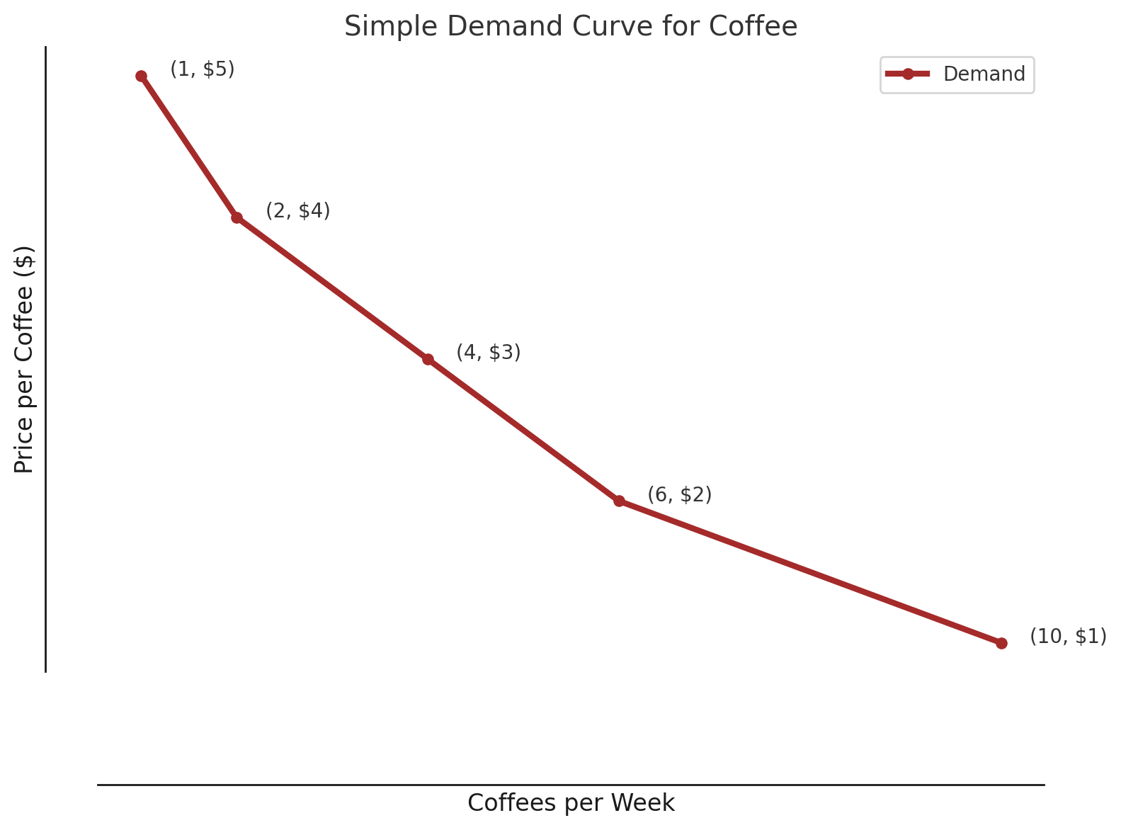
To build your demand curve, plot each price-quantity pair as a point on a graph. Price goes on the vertical axis, quantity on the horizontal axis.
So you'd plot: ($5, 1), ($4, 2), ($3, 4), ($2, 6), ($1, 10).
Engagement Message
Which way does the pattern slope—upward or downward?
Connect these points with a smooth line and voilà - you've built a demand curve! The line slopes downward from left to right, showing the inverse relationship between price and quantity.
This is your first real demand curve from actual data.
Engagement Message
What does the downward slope tell you about buyer behavior?
This pattern has a name: the Law of Demand. It states that when price increases, quantity demanded decreases (and vice versa), all else being equal.
Notice that key phrase: "all else being equal." That's crucial for understanding demand curves.
