Numbers alone rarely inspire action. Yet data without narrative lacks the emotional pull to drive change. As a Product Manager, you've mastered crafting compelling narratives in the previous lesson—now you'll learn to infuse those stories with the undeniable power of data. Data-driven storytelling transforms abstract metrics into concrete realities that stakeholders can't ignore. It's the difference between saying "retention is down" and revealing "we're losing 300 customers daily, each one representing a real person whose workflow we've failed to support."
Throughout this lesson, you'll discover how to transform raw metrics into compelling narratives that drive action. The most persuasive Product Managers understand that data and narrative aren't opposing forces—they're complementary tools that, when combined skillfully, create an irresistible case for change. You'll master the art of weaving metrics with human stories, selecting visualizations that make complex patterns instantly clear, and positioning your data within the broader business context to maximize impact. These skills will transform you from someone who merely presents information into someone who drives strategic decisions.
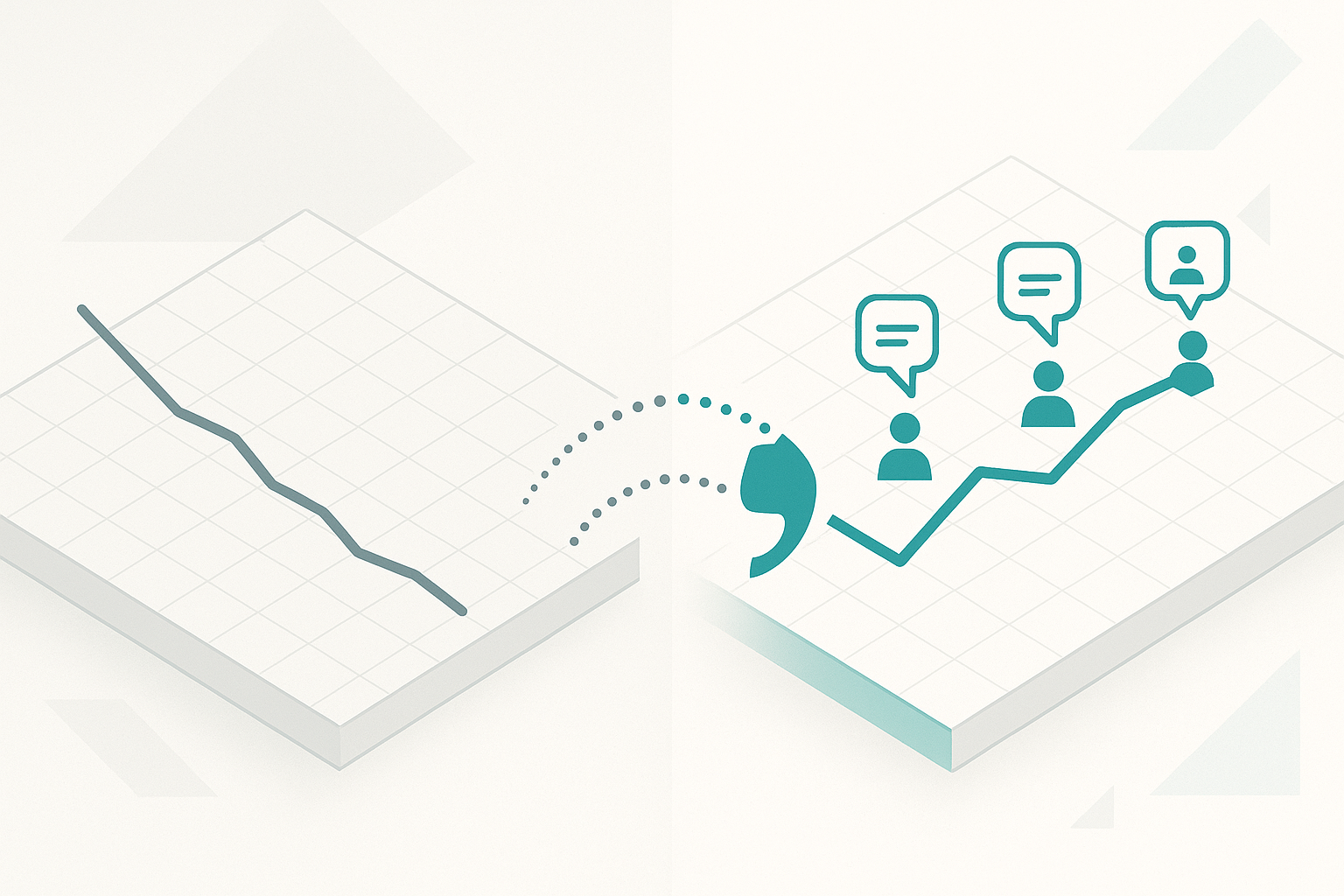
The art of blending metrics with user quotes lies in creating a dialogue between the quantitative and qualitative—where numbers provide the scale and user voices provide the soul. When you say "our NPS dropped 15 points," stakeholders hear a metric. But when you follow with "customers are telling us: 'I used to recommend you to everyone, but now I warn them about the bugs,'" suddenly that number represents real relationships being damaged. This combination creates what psychologists call the identifiable victim effect—our brains respond more powerfully to specific, relatable stories than to statistics alone.
Start by selecting metrics that directly connect to business outcomes your stakeholders care about. Revenue metrics speak to executives, velocity metrics resonate with engineering leads, and satisfaction scores matter to customer success teams. However, don't stop at the number—immediately humanize it with a carefully chosen quote that exemplifies what that metric represents. For instance, when presenting a 40% increase in support tickets, follow with: "One customer wrote: 'I spend more time troubleshooting your product than using it to solve my actual problems.'" This pairing makes the metric impossible to dismiss as just a number on a dashboard.
Let's observe how this technique transforms a typical product discussion:
- Dan: Our feature adoption is at 42%, which is below our Q3 target of 55%.
- Victoria: That's concerning, but what does that really mean for our users?
- Dan: Well, let me reframe this. Feature adoption dropped to 42% last quarter, and when we dug into the why, users are literally telling us:
"I can't figure out what this feature even does."One power user who's been with us for three years said:"I clicked around for 10 minutes and gave up."This means we're spending 60% of our development effort on features that create no value.- Victoria: Now I understand the urgency. It's not just a missed metric—we're failing our most loyal users and wasting resources. What's your recommendation?
- Dan: Based on the pattern—67% of users who didn't adopt cited confusion in exit surveys—we need to invest two sprints in discovery and onboarding improvements. This could recover $1.2M in potential revenue from existing users.
- Victoria: The combination of that user quote with the financial impact makes this crystal clear. Let's prioritize this for next sprint.
Notice how Dan's second attempt completely changed Victoria's engagement level. By blending the metric with a specific user quote and then connecting it to business implications, he transformed an abstract percentage into an urgent, actionable insight that secured immediate buy-in.
The credibility of your insights depends on the representativeness of your quotes, not just their emotional impact. Cherry-picking the most dramatic outlier quote might grab attention initially, but it erodes trust when stakeholders discover it's not typical. Instead, explicitly connect quotes to patterns in your data by saying something like: "This frustration about complex setup isn't isolated—67% of churned users cited the same issue, and here's how three different customers expressed it." By showing that individual quotes represent broader trends, you build a foundation of trust that makes your recommendations more persuasive.
Timing and sequencing matter enormously when blending metrics and quotes. Leading with an emotionally charged quote can capture attention, but following immediately with supporting metrics grounds that emotion in reality. Conversely, starting with a stark metric and then humanizing it with user voices can create a powerful one-two punch. Consider this sequence: "Time to first value has increased to 8.3 days" followed by "A new user messaged us: 'I've been trying to set this up for a week—at this point, I'd rather go back to spreadsheets.'" The metric establishes the problem's scope while the quote makes it visceral and urgent.
When presenting to data-skeptical audiences, let metrics do the heavy lifting while using quotes as memorable anchors. With numbers-driven stakeholders, you might present a correlation analysis showing the relationship between setup time and churn, then punctuate with a single powerful quote that crystallizes the finding. For audiences who lead with emotion, reverse this approach—open with a compelling customer story, then support it with rigorous metrics that prove it's not anecdotal. This adaptive approach ensures your message lands regardless of your audience's default thinking style.
The most effective Product Managers create what I call evidence sandwiches—layering metric, quote, and implication in quick succession. For example: "Feature adoption dropped to 42% last quarter" (metric), "with users saying 'I can't figure out what this feature even does'" (quote), "meaning we're spending 60% of our development effort on features that create no value" (implication). This structure moves stakeholders rapidly from data to human impact to business consequence, creating momentum toward action. Practice this three-part structure until it becomes second nature—it will transform how stakeholders respond to your presentations.
Remember that silence and space amplify impact. After delivering a particularly powerful metric-quote combination, pause. Let it sink in. Resist the urge to immediately fill the silence with more data. That moment of reflection is when stakeholders internalize the insight and begin to feel the urgency you're conveying. A well-placed pause after "We're losing $50,000 in revenue monthly, and customers are literally telling us: 'Your competitor does this better and cheaper'" can be more persuasive than ten additional slides of analysis.
Your visualization choice can make the difference between immediate understanding and confused disengagement. The human brain processes visual information 60,000 times faster than text, making your chart selection crucial for rapid comprehension. But here's what most Product Managers miss: the best visualization isn't the most sophisticated or beautiful—it's the one that makes your key insight impossible to miss within three seconds of viewing.
The cognitive load of your visualization must match your audience's available attention. In a quarterly review where executives are seeing dozens of slides, a complex scatter plot with multiple variables will fail, regardless of how insightful it might be. Instead, choose visualizations that tell one clear story. A simple line chart showing churn rate climbing steadily over three months communicates urgency more effectively than a sophisticated cohort analysis that requires explanation. Save complexity for working sessions where you have time to guide interpretation.

Different visualizations naturally emphasize different aspects of your data, and understanding these strengths is crucial. Line charts excel at showing trends over time—perfect for demonstrating how a metric has degraded or improved. When you need stakeholders to see that feature adoption has been declining for six straight weeks, a line chart makes this trajectory undeniable. Bar charts facilitate comparison—ideal when you need to contrast your performance against competitors or compare metrics across different user segments. Use them when the story is about relative performance, such as "Our setup time is 3x longer than our closest competitor." Meanwhile, funnel charts reveal process efficiency, making them perfect for showing where users drop off in multi-step workflows. When 73% of users abandon at the payment step, a funnel visualization makes this bottleneck visually obvious.
Heat maps and cohort retention charts serve specific narrative purposes that simpler charts can't achieve. When you need to show that retention problems aren't uniform but concentrated in specific user segments or time periods, a retention heat map reveals patterns that would be invisible in aggregate metrics. Imagine showing a heat map where newer cohorts glow bright red with churn while older cohorts remain green—the visual immediately communicates that something changed recently that's driving users away. However, use these complex visualizations sparingly and only when simpler options can't tell your story effectively.
Your visualization should guide the eye to your key insight through deliberate use of color, size, and annotation. If your story is about a specific inflection point where metrics turned negative, highlight that moment with a different color or a prominent annotation. Don't make viewers hunt for the important part—make it visually dominant. When showing how a product change impacted metrics, add a vertical line marking the release date with a clear label. Use color strategically: red for problems, green for improvements, and gray for less important context. Avoid rainbow charts that use color decoratively rather than meaningfully, as they increase cognitive load without adding information.
The principle of progressive disclosure applies powerfully to data visualization. Start with the simplest view that communicates your main point, then layer on complexity only as needed. You might begin with a single KPI shown as a large number with a trend arrow, then click to reveal the time series, then add comparative benchmarks. This approach prevents overwhelming viewers while allowing curious stakeholders to dig deeper. In presentation software, use animation to build complex charts step by step, controlling the narrative pace and ensuring comprehension at each stage.
Context transforms good visualizations into great ones. Never show a metric in isolation—always provide comparison points that help viewers interpret significance. A 5% churn rate means nothing without knowing whether that's up or down from last quarter, how it compares to industry benchmarks, or what it means in absolute customer numbers. Add reference lines for targets, historical averages, or critical thresholds. These contextual elements transform raw data into actionable insights. When presenting support ticket volume, include a horizontal line showing your team's capacity—suddenly the chart tells a story about an overwhelmed support team rather than just rising numbers.