Calculating the Range
Introduction
Welcome to Measuring Spread with Range and IQR, the third course in our statistics learning path! In the first two courses, you learned how to read distributions from graphs and how to summarize center using mode, median, and mean. Those skills gave you a way to describe where data tends to cluster. Now we move to the next natural question: how spread out is the data? This course focuses on tools that answer that question, and in this first lesson we start with the simplest one of all: the range.
Why Spread Matters
Knowing the center of a dataset tells you a lot, but it never tells the whole story. Imagine two coffee shops that both sell an average of 200 cups per day. At Shop A, daily sales bounce between 190 and 210 cups. At Shop B, they swing from 50 cups on slow days to 350 on busy ones.
The average is the same, yet the day-to-day experience is completely different. That difference is what we call spread (also known as variability). Measuring spread helps us understand how consistent or unpredictable the data is, and it is an essential companion to any measure of center.
What Is the Range?
The range is the simplest way to measure spread. It answers one focused question: how far apart are the most extreme values in the dataset?
To compute it, subtract the smallest value (the minimum) from the largest value (the maximum):
The result tells you the total span the data covers. A larger range means the data stretches over a wider interval; a smaller range means the values stay closer together.
Computing the Range: A Worked Example
Suppose you recorded the daily high temperatures (in °F) for one week:
| Day | Mon | Tue | Wed | Thu | Fri | Sat | Sun |
|---|---|---|---|---|---|---|---|
| Temp (°F) | 58 | 63 | 61 | 67 | 72 | 70 | 65 |
Here is the process:
- Find the maximum. Scanning the values, the highest temperature is .
- Find the minimum. The lowest temperature is .
- Subtract. °F.
The range is 14 °F, meaning all seven daily highs fall within a 14-degree window. Notice that you do not need to sort the data first — you only need to locate the largest and smallest values.
Reading the Range from a Graph
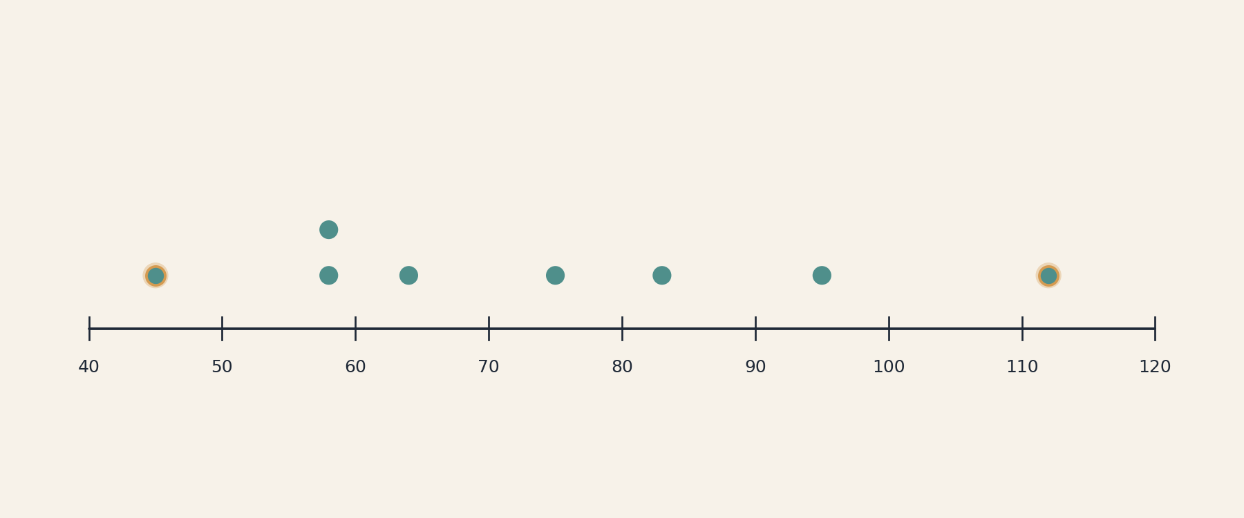
You can also find the range directly from a visual display such as a dot plot. On a dot plot, the minimum is the leftmost dot and the maximum is the rightmost dot. Simply read those two values off the horizontal axis and subtract. (A histogram groups values into bars, so the exact minimum and maximum are usually hidden inside the first and last bars. You could estimate the range from a histogram, but you generally cannot read the precise value.)
For example, if a dot plot of weekly grocery bills shows the leftmost dot sitting at $45 and the rightmost dot at $112, then:
The calculation is identical to working from a table. The only difference is that you pull your minimum and maximum from the graph instead of from a list of numbers.
What the Range Does Not Show
The range uses only two data points — the maximum and the minimum. Everything between those endpoints is invisible to it, and that is the range's biggest limitation.
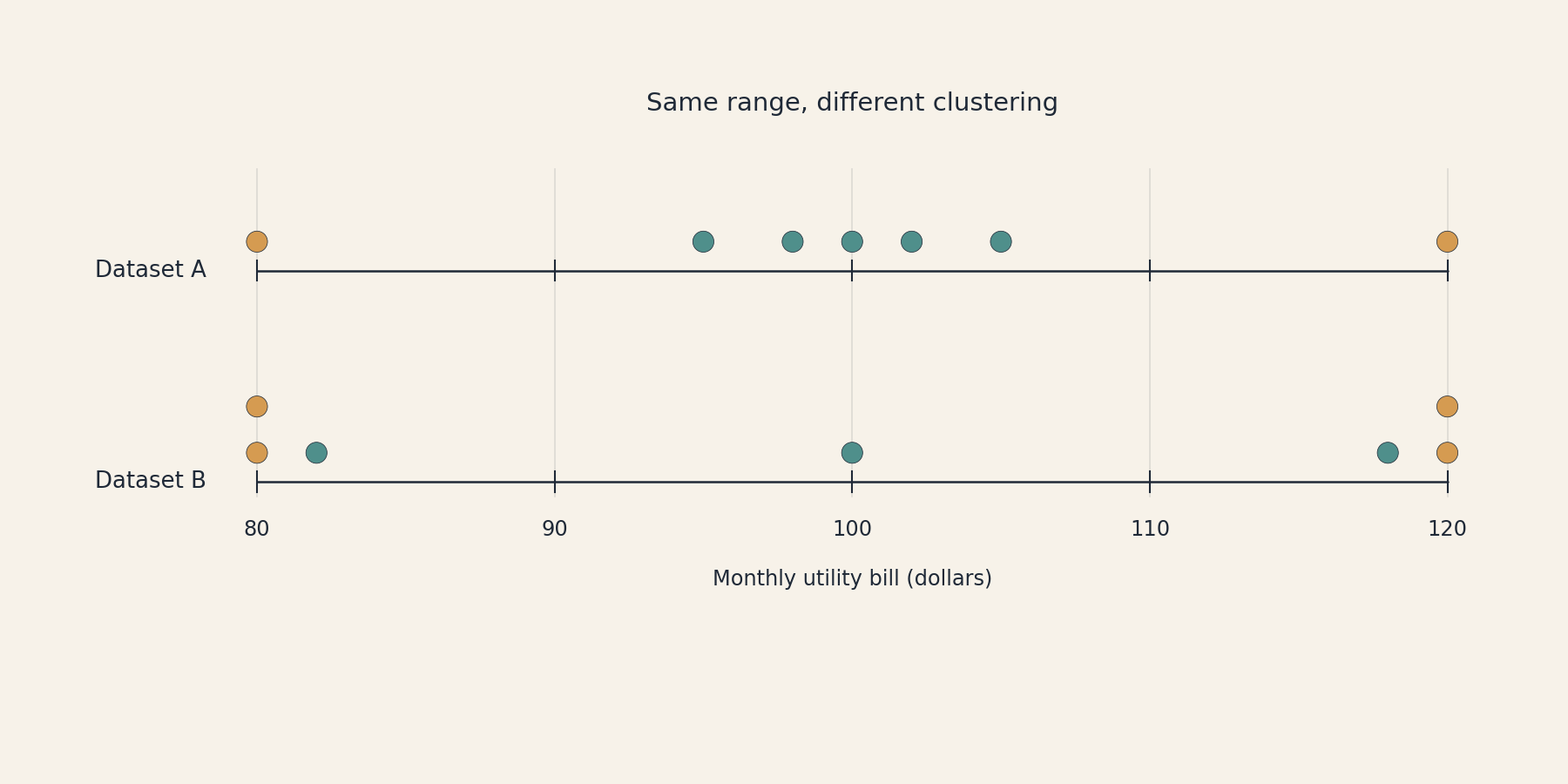
Consider two small datasets of monthly utility bills (in dollars):
- Dataset A: 80, 95, 98, 100, 102, 105, 120
- Dataset B: 80, 80, 82, 100, 118, 120, 120
Both datasets have a minimum of $80 and a maximum of $120, so both produce a range of $40. But the patterns are quite different. In Dataset A, most bills cluster tightly around $100. In Dataset B, bills pile up near both extremes with little in the middle.
The range treats these two datasets as equally spread, even though one is much more concentrated than the other. On top of this, a single unusual value can stretch the range dramatically. If one bill in Dataset A jumped to $250, the range would leap from $40 to $170, even though the other six bills stayed put. This sensitivity to outliers is another reason the range, while useful as a quick first look, should not be your only measure of spread.
Conclusion and Next Steps
The range equals and gives you the total span of a dataset in one quick subtraction. It is easy to compute from a list of values or by reading extreme points off a graph. However, because it relies on only two data points, the range cannot reveal how values between those endpoints are distributed. Two datasets with the same range can tell very different stories about spread.
These limitations are exactly what will motivate the more detailed measures you explore in the upcoming lessons, starting with quartiles and the interquartile range. For now, head into the practice exercises to calculate ranges, read graphs, and discover for yourself why the range is a helpful starting point but never the final word on spread!