Understanding the Mode
Welcome to Measures of Center
Welcome to Measures of Center, the second course in our learning path! This course builds directly on the skills covered in the required previous course, Reading and Describing Distributions. In that course, we explored how to read dot plots and histograms, describe shape and spread, and spot outliers. We also discovered that visual judgments can be ambiguous, which is why numerical summaries matter.
This course introduces three powerful numerical summaries: the mode, the median, and the mean. This is the first lesson out of five, and our focus today is the simplest of the three: the mode. By the end of this lesson, we will know how to find the mode, handle a few special cases, and recognize when the mode is the most informative way to describe what is "typical."
What Does "Typical" Mean?
Imagine a friend asks, "What shoe size do people usually buy at your store?" They are not asking for a full sales report. They want one value that captures the general trend. That single representative value is what statisticians call a measure of center.
There are several ways to define "typical," and each measure of center captures it differently. The mode answers the question in the most direct way possible: which value shows up the most?
What Is the Mode?
The mode of a dataset is the value that occurs most frequently. That is the entire definition — no special formula, just careful counting.
Let's walk through a quick example. Suppose a small shoe store records these sizes sold in one hour:
To find the mode, we count how many times each value appears:
| Size | Frequency |
|---|---|
| 7 | 2 |
| 8 | 3 |
| 9 | 1 |
| 10 | 1 |
Size appears three times, more than any other value, so the mode is . Here is the general procedure:
- List each distinct value in the dataset.
- Count how often each value occurs.
- The value with the highest count is the mode.
No Mode, One Mode, or Many
Not every dataset fits neatly into the example above. There are three scenarios we need to recognize.
One mode (unimodal). This is the most common case. One value clearly appears more often than all others, just like size in our shoe store example.
Two or more modes (bimodal or multimodal). Sometimes two or more values tie for the highest frequency. Consider daily high temperatures (in °F) recorded over one week:
Here both and appear twice, while every other value appears once. Because two values share the top count, this dataset is called bimodal. If three or more values share the highest frequency, we would call it multimodal.
No mode. If no value in a dataset is repeated, there is no value that occurs "the most." For example, in the dataset , each value occurs exactly once. In this specific case where there are no repeats, we say the dataset has no mode.
Spotting the Mode on a Graph
As we learned in the previous course, dot plots and bar charts show how often each value appears. The mode has a simple visual signature: it sits under the tallest column or the tallest stack of dots.
Picture a dot plot of T-shirt sizes ordered for a company event. In the example below, the column above size L has more dots than any other column, so L is the mode.
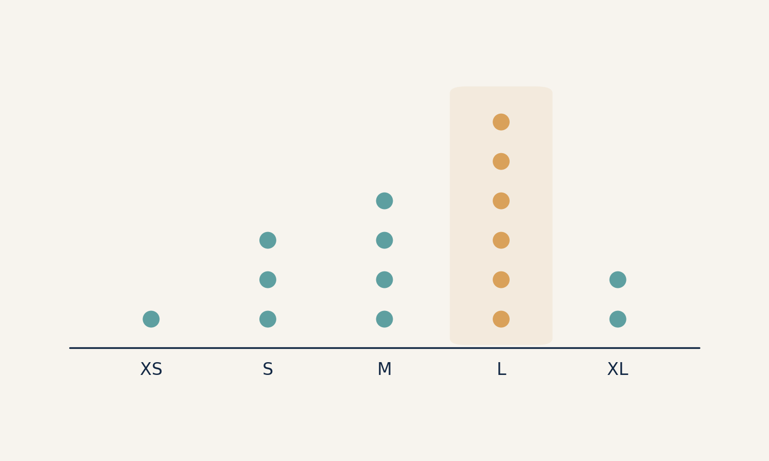
We do not even need to count every dot; we just look for the peak. This makes the mode the easiest measure of center to read directly from a graph.
When the Mode Is the Best Summary
So far we have treated the mode as a simple counting exercise. Its real power, however, appears in one situation that the other measures of center simply cannot handle: categorical data.
Consider a survey asking guests at a party to name their favorite pizza topping:
| Topping | Votes |
|---|---|
| Pepperoni | 6 |
| Mushroom | 3 |
| Olive | 2 |
| Pineapple | 1 |
The mode is Pepperoni because it received the most votes. Notice that computing a mean or median of pizza toppings makes no sense — we cannot add or sort words on a number line. When the data consist of categories (colors, brands, toppings, zip codes), the mode is often the only measure of center that applies.
Even with numerical data, the mode shines whenever we care about the single most common outcome. A clothing buyer deciding how many units of each shoe size to reorder, for instance, cares most about which size sells the most, not the arithmetic average of all sizes sold.
Conclusion and Next Steps
In this lesson we learned that the mode is the most frequently occurring value in a dataset. A dataset can be unimodal, bimodal, multimodal, or have no mode at all depending on how the frequencies are distributed. On a graph, the mode is easy to spot — just look for the tallest column. We also saw that the mode is the go-to measure of center for categorical data and for any "most popular" question, since mean and median require numbers on a scale.
Now it is time to put these ideas to work in the practice exercises ahead. We will find modes from raw data and graphs, sort out tricky cases like bimodal and no-mode datasets, and explain why the mode is sometimes the smartest summary to choose. In the next lesson, we will move on to our second measure of center — the median — and learn how to find the middle value when data are placed in order.
