Choosing the Best Center
Welcome to the Final Lesson
We have arrived at the finish line. This is the fifth and final lesson of Measures of Center, and it is the one where everything clicks into place. In the first four lessons, we learned how to calculate the mode, the median, and the mean, and we saw what happens when outliers enter the picture. Now we shift from calculation to judgment: given a real dataset, which measure should we actually report?
By the end of this lesson, we will be able to match each measure to the situation where it works best, spot cases where no single center tells the whole story, and communicate our choice clearly in everyday language.
The Right Tool for the Job
Think of the mode, median, and mean as three different tools in a toolbox. A skilled carpenter does not grab a tool at random; they pick the one that fits the task at hand. Our job is the same. The best measure of center depends on three things: the type of data we are summarizing (categorical or numerical), the shape of the distribution (symmetric, skewed, or bimodal), and the presence of outliers.
These three factors form a simple decision path. Let's walk through each situation one at a time, starting with the measure that has the most specific use case and working toward the trickier judgment calls.
When Mode Is the Best Choice
The mode is the most frequently occurring value, and it is the only measure of center that works for categorical data — data whose values are labels or categories rather than numbers.
Suppose a coffee shop surveys 150 customers about their favorite drink. The results are: Latte (58), Drip Coffee (42), Cappuccino (31), Tea (19). We cannot add these labels together to compute a mean, and there is no way to sort drink names into a "middle" position. The mode, Latte, is the only meaningful summary of the most popular choice.
Use the mode when:
- The data are categorical (colors, brands, preferences, etc.).
- We want to answer "Which value is most common?" or "What is the most popular option?"
- A numerical dataset has a clear, frequently repeated value that carries practical meaning.
For purely numerical data where we care about a "typical" value, the mode is usually less informative, because many numerical datasets have no repeated values at all. That is where the median and the mean take over.
When Median Tells the Clearest Story
The median is resistant to outliers because it depends only on the middle position in the sorted data, not on how far away the extremes sit. This makes it especially useful when the data are skewed or contain outliers — exactly the scenario we studied in the previous lesson.
Consider home prices in a neighborhood. Most homes might sell for between $200,000 and $350,000, but a single lakefront property sells for $1.4 million. The mean would be pulled sharply upward by that one sale and might suggest a "typical" price well above what most buyers actually pay. The median would sit right in the cluster where most prices fall, giving a much more honest picture.
Use the median when:
- The data are numerical and the distribution is skewed (a long tail on one side).
- Outliers are present or likely.
- We want to describe what a "typical" individual experiences, without letting extremes distort the summary.
This is exactly why reports on household income or home prices almost always use the median rather than the mean.
When Mean Is the Natural Choice
The mean uses every value in the dataset, which makes it the most information-rich measure when the data cooperate. By "cooperate," we mean the distribution is roughly symmetric and free of notable outliers. In that setting, the mean and median will be close to each other, but the mean carries extra information because it accounts for the exact size of every observation.
Imagine recording the heights of 30 adult women in a fitness class. Heights tend to follow a roughly symmetric, bell-shaped pattern with no dramatic outliers. If the values sum to cm, the mean is:
That single number summarizes the group well and can also feed into further calculations like standard deviation, which we will meet in a later course.
Use the mean when:
- The data are numerical and the distribution is roughly symmetric.
- There are no significant outliers pulling the sum in one direction.
- We plan to use the summary in further statistical calculations.
When No Single Center Works
Sometimes none of the three measures gives a useful summary on its own. The most common situation is a bimodal distribution — one with two distinct peaks.
Picture the arrival times at a popular restaurant over the course of a day. There is a cluster of arrivals around 12:00 p.m. (lunch) and another cluster around 7:00 p.m. (dinner), with very few arrivals in between. If we compute the mean arrival time, we might get something like 3:30 p.m. — a time when the restaurant is nearly empty. The median would land in a similar no-man's-land. Neither number describes a "typical" arrival, because there is no single typical arrival; there are two.
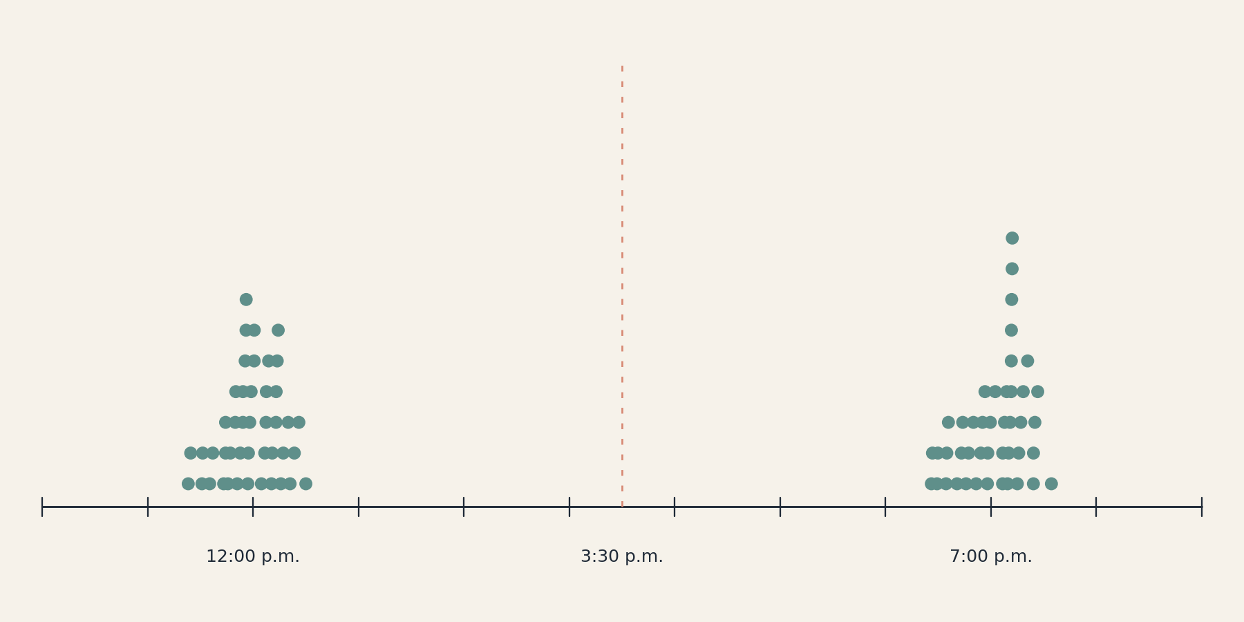
When we encounter a bimodal distribution, the most informative approach is to:
- Acknowledge the shape — report that the data have two peaks.
- Summarize each group separately — give the center of the lunch cluster and the center of the dinner cluster.
Recognizing when a single center is misleading is just as important as knowing how to calculate one.
A Quick Decision Guide
The table below pulls together everything we have discussed into a single reference. When we face a new dataset, we can work through these questions in order — but keep one important rule in mind: if the distribution is bimodal (or multimodal), that observation comes first, because reporting any single number would be misleading regardless of which measure we pick.
| Question | Recommended Measure |
|---|---|
| Does the distribution have two or more distinct peaks? | No single center — describe shape and summarize each group |
| Are the data categorical (labels, names)? | Mode |
| Are the data numerical and roughly symmetric with no major outliers? | Mean |
| Are the data numerical but skewed or outlier-prone? | Median |
Start at the top and work down. The first "yes" points us to the right choice. In practice, glancing at a histogram or dot plot is often enough to settle the question before we ever reach for a calculator.
Stating Our Choice in Context
Picking the right measure is only half the job. The other half is communicating what it means. A bare number like "$41,000" is not very helpful on its own. Good practice is to state three things in a single sentence:
- Which measure we are reporting (mean, median, or mode).
- What the value is, with units.
- Why we chose that measure (briefly referencing shape or outliers).
For example: "The median monthly rent in the city is $1,250. We report the median because the distribution of rents is right-skewed, with a few luxury listings that would inflate the mean."
That short explanation tells the reader the number, its meaning, and why it is trustworthy — all at once. Whenever we present a summary to someone else, whether a colleague, a client, or a classroom, this three-part pattern helps our audience trust and understand the result.
Conclusion and Next Steps
In this final lesson of Measures of Center, we shifted from calculation to judgment. The mode is our go-to for categorical data and "most popular" questions. The median is the best reporter of a typical value when the data are skewed or contain outliers. The mean shines when the distribution is symmetric and outlier-free. And when the distribution has two or more peaks, no single measure of center can do the job alone — we need to describe the shape and summarize each group separately.
With all five lessons now complete, we have a full toolkit for finding, choosing, and interpreting the center of a dataset. Up next are the practice exercises, where we will match measures to scenarios, wrestle with a tricky bimodal case, and write our own plain-language justifications — let's jump in and put our decision-making skills to the test!
