Hello and welcome to the third lesson of "Game On: Integrating RL Agents with Environments"! In our previous lessons, we learned how to integrate a reinforcement learning agent with an environment and explored the crucial exploration-exploitation trade-off that affects learning performance.
Today, we're diving into an equally important aspect of reinforcement learning: visualizing training statistics. When building RL systems, it's essential to track and visualize how our agents are performing over time. Without proper visualization, it can be challenging to understand whether our agent is actually learning, how quickly it's improving, or if it's getting stuck in suboptimal behaviors.
By the end of this lesson, we'll be able to track, analyze, and visualize key performance metrics of our reinforcement learning agent. These visualization tools will help us gain insights into the learning process, identify issues, and make informed decisions about how to improve our agents. Let's get started!
When training RL agents, we often run hundreds or thousands of episodes over many hours. Without proper visualization, it's nearly impossible to understand what's happening during this training process. Thus, visualization serves several critical purposes in RL:
- Monitoring progress: Visualizations provide an immediate sense of whether your agent is learning or not.
- Debugging: Abnormal patterns in learning curves can alert you to bugs in your implementation.
- Hyperparameter tuning: Comparing visualization results helps identify optimal hyperparameter settings.
- Insight generation: Patterns in visualizations can reveal insights about the nature of your environment and agent.
- Communication: Graphs and charts communicate your results effectively to others.
Think of visualization as your window into the black box of RL. Without it, you're essentially flying blind, hoping your agent is learning properly but having no way to confirm. In research papers and industry projects, learning curves are standard practice for a reason — they tell the story of an agent's learning journey in a clear, interpretable format. Let's build the tools to create these visualizations for our own agents.
Before we start implementing visualization functions, we need to understand the key metrics that help us evaluate an agent's performance. We are focusing on three simple, yet fundamental, metrics:
- Total rewards per episode: The sum of rewards received during each episode. This is the primary indicator of how well the agent is performing its task.
- Steps per episode: The number of actions needed to complete an episode. For goal-oriented tasks like our grid world, fewer steps generally indicate more efficient behavior.
- Success rate: The percentage of episodes where the agent successfully achieved the goal. This is especially relevant for tasks with clear success/failure outcomes.
But specifically, what should we be expecting to see in these metrics as learning progresses?
- Rewards: Should generally increase over time as the agent learns better strategies.
- Steps: Should decrease over time as the agent finds more efficient paths.
- Success rate: Should increase from initial random performance to consistently achieving the goal.
To create meaningful visualizations, we first need to collect relevant statistics during the training process. We'll modify our training function to track the three key metrics we just discussed, as these metrics will provide a comprehensive view of our agent's learning progress:
This training function incorporates several important elements for effective visualization:
- Storage of episodic data in separate arrays for each metric
- Calculation of moving averages to smooth out noise and identify trends
- Periodic progress reporting to monitor training in real-time
- Return of all statistics in a structured format that will be easy to pass to our visualization functions
Now let's begin creating visualizations with Matplotlib. We'll start with a basic plot for rewards and then build up to a more comprehensive visualization:
This function starts creating our visualization with:
- A figure of suitable size for three side-by-side plots
- A subplot dedicated to the reward metric
- Two lines on this plot — the raw rewards (with transparency to reduce visual noise) and a moving average
The moving average calculation uses NumPy's convolve function, which is perfect for this task. It slides a window over our data and computes the average at each position. The mode='valid' parameter ensures we only get results where the window fully overlaps with our data.
We've also added a legend to distinguish between the raw data and moving average, which helps the reader interpret the plot.
Now let's complete our visualization by adding plots for the other two metrics:
For the steps plot, we follow the same approach as with rewards — showing both raw data and a moving average. However, for the success rate, we only display the moving average because the raw data would be binary (0 or 1) and would create a visually cluttered plot.
Notice the plt.ylim([-0.05, 1.05]) line — this ensures our success rate plot has a fixed y-axis range from 0 to 1 (with a small margin). This makes the plot more interpretable as a percentage.
Let's finalize our function by adding code to save the visualization:
The tight_layout() function automatically adjusts the spacing between our subplots to prevent overlap, creating a cleaner visualization. We save the figure and close it to free memory, which is especially important when training multiple agents or running multiple experiments.
Now that we've set up our plots, let's walk through how to interpret the results and what they tell us about the agent's learning process. Below is a typical outcome for a 200-episode training run, with three side-by-side plots:
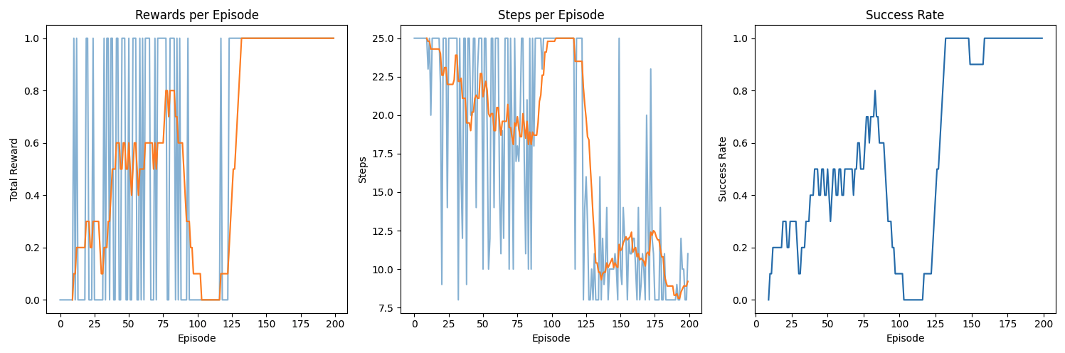
Let's breakdown these plots:
-
Rewards per Episode
- Raw vs. Moving Average: The raw reward values (blue line) fluctuate from episode to episode, especially early on when the agent has not yet learned a stable policy. The moving average (orange line) smooths these fluctuations, allowing you to see clearer trends.
- Early Episodes: In the initial phase, the agent often receives low or zero reward because it acts randomly and does not consistently reach the goal. You may notice a handful of “spikes” in reward if it happens to stumble into the correct behavior by chance.
- Later Episodes: Over time, as learning progresses, you can see the moving average of the rewards rising, indicating that the agent is more consistently achieving the goal.
-
Steps per Episode
- Efficiency Measure: In many goal-oriented tasks (like a GridWorld or Maze), fewer steps per episode generally indicates more efficient behavior. Early in training, the agent typically takes many steps—often the environment's maximum step limit—because it does not know how to reach the goal quickly.
- Downward Trend: As the agent learns a better strategy, you can see the steps-per-episode curve trend downward. This reflects that the agent is discovering shorter (and thus more efficient) paths to the goal.
- Variability: Even well-performing agents can show occasional spikes in the number of steps if they explore or get temporarily “lost.” However, the overall moving average should descend if learning is effective.
-
Success Rate
- Binary Outcomes: The success rate tracks whether the agent succeeded or failed in each episode. The raw data for a single episode would be either 0 or 1, which can look very scattered in a plot. Consequently, we often plot only the moving average to see a smooth trend.
- Initial Phase: Typically, the success rate starts near 0 when the agent is learning from scratch. You might see a slow, incremental climb as it discovers partial strategies.
- Breakthrough and Convergence: Once the agent finds a good policy (often after some key exploratory episodes), the success rate can jump significantly. In successful training, the moving average may approach or reach 1.0, indicating the agent consistently achieves the goal.
Occasional dips or plateaus are part of the normal learning process—especially in stochastic environments or when an agent's exploration temporarily overrides exploitation. By carefully analyzing these plots, you can diagnose whether training is on track, tune hyperparameters (e.g., learning rate or epsilon in (\epsilon)-greedy strategies), or spot potential bugs if the curves behave unexpectedly.
Excellent work! You've now developed a powerful set of tools for tracking and visualizing the performance of reinforcement learning agents. These visualization capabilities transform the often opaque process of RL training into something tangible and interpretable, allowing you to identify trends, diagnose issues, and make data-driven improvements to your agents.
In this lesson, we've covered why visualization matters in RL, what key metrics to track, how to collect training statistics, and how to create effective visualizations with Matplotlib. We've also discussed how to interpret learning curves to gain insights into agent performance. As you continue your reinforcement learning journey, these visualization skills will prove invaluable for developing, debugging, and optimizing increasingly sophisticated agents in more complex environments.
