After mastering priority planning and agile delivery, you now face the critical challenge of understanding whether your efforts actually create value. The most elegant roadmap and flawless sprint execution mean nothing if you can't measure real impact and adapt based on what you learn. This lesson transforms you from someone who ships features into someone who drives measurable business outcomes, teaching you to build measurement systems that reveal truth, interpret signals that demand action, and make bold decisions when data challenges your assumptions.
The harsh reality of product management is that most features fail to move the metrics that matter. You'll launch something you're certain will transform user behavior, only to watch adoption languish at half your target while executives question your judgment. What separates exceptional Product Managers from the mediocre isn't their ability to avoid failure—it's their systematic approach to measuring impact, learning from disappointment, and adapting rapidly when reality diverges from projections. Throughout this lesson, you'll develop the measurement discipline and decision-making courage that transforms failed experiments into valuable insights and unexpected successes into scalable victories.
The dashboard you build today determines the decisions you'll make tomorrow. Yet most Product Managers inherit a scattered collection of reports, spreadsheets, and ad-hoc queries that obscure more than they reveal. Building effective real-time dashboards isn't about displaying every available metric—it's about creating focused instruments that track the vital signs of your product's health and alert you to problems before they become crises.
Your first challenge lies in selecting which KPIs deserve dashboard prominence from the overwhelming array of available metrics. The temptation to track everything leads to dashboards that resemble airplane cockpits, requiring expertise to interpret and overwhelming stakeholders with noise. Instead, you must identify the critical few metrics that genuinely indicate whether your product delivers value. For instance, if your objective is improving user engagement, tracking daily active users, session duration, and feature adoption rate provides far more insight than monitoring dozens of tangential metrics that merely satisfy curiosity.

Beyond metric selection, the technical architecture of your dashboard profoundly impacts its usefulness. Real-time doesn't always mean instantaneous—it means fresh enough to enable timely decisions. When your data warehouse operates at 92% capacity and engineering resources are stretched thin, you must make intelligent trade-offs between data freshness and system stability. You might decide that revenue metrics update hourly while user behavior metrics refresh every four hours, or you might implement sampling strategies that provide directional accuracy without overwhelming infrastructure. The conversation with your data team often centers on pragmatic choices: "We can either have perfect accuracy with 6-hour latency or 95% accuracy with 30-minute latency—which better serves our decision-making needs?"
Creating effective visualizations requires understanding how different audiences consume information. Your engineering lead needs granular performance metrics with technical detail, while your CEO wants trend lines and exception reporting. The same data about feature adoption might appear as a detailed funnel analysis for product team standups but transform into a simple health indicator—green, yellow, or red—for executive reviews. This isn't dumbing down information; rather, it's respecting cognitive load and ensuring each audience receives insights in their most actionable form.
Furthermore, the hidden power of dashboards emerges when they become conversation catalysts rather than reporting endpoints. When your dashboard shows feature adoption at 12% versus the 20% target, the valuable discussion isn't about the gap—it's about what the data suggests about user behavior and what experiments might close that gap. Your dashboard should prompt questions like "Why do users who complete configuration in under 5 minutes show 3x higher retention?" rather than simply stating "Configuration completion rate is 67%." This shift from passive reporting to active investigation transforms dashboards from scorecards into learning instruments.
Most importantly, you must architect your dashboard to surface early warning signals before metrics crater completely. Leading indicators like time to first value or configuration abandonment rate predict future problems weeks before they appear in revenue metrics. By the time monthly recurring revenue drops, the damage is done. However, if your dashboard alerts you that new user activation has declined for two consecutive weeks, you have time to investigate and intervene. This predictive capability transforms you from a reactive firefighter into a proactive problem-solver who addresses issues before stakeholders even notice them.
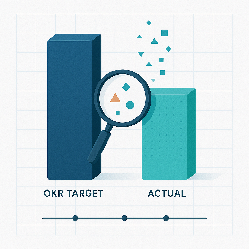
Setting ambitious OKRs is easy; honestly evaluating performance against them requires courage and analytical rigor. When your Premium Analytics feature achieves only 60% of its adoption target, the natural human instinct is to explain away the miss with external factors—competitive pressure, technical constraints, market conditions. But exceptional Product Managers resist this temptation, using OKR comparison as a learning opportunity rather than a judgment day.
The first discipline in OKR evaluation is maintaining definitional consistency throughout the measurement period. You'd be surprised how often teams retroactively redefine success when results disappoint. The conversation might start with "Well, when we said 20% adoption, we really meant among power users..." or "The $75K MRR increase target assumed the sales team would close those enterprise deals..." These post-hoc adjustments destroy accountability and prevent genuine learning. When you set an OKR, you must document exactly what success means, how you'll measure it, and what assumptions underpin your targets.
Additionally, understanding the difference between failure of execution and failure of strategy proves crucial when comparing results to OKRs. If your feature achieved only 12% adoption against a 20% target, you must determine whether the feature itself lacks product-market fit or whether implementation problems hobbled adoption. User interviews might reveal that 73% find configuration too complex—an execution issue you can address through interface simplification. Alternatively, the core value proposition might not resonate with users despite flawless execution—a strategic miss requiring deeper reconsideration. This distinction determines whether you iterate on the current approach or pivot to something fundamentally different.
The timing of OKR evaluation significantly impacts the conclusions you draw. Measuring too early might show failure when success is still building; measuring too late might waste resources on obviously failing initiatives. Therefore, you need to establish meaningful checkpoints that provide sufficient signal while preserving flexibility to adapt. A quarterly OKR might have monthly check-ins where you assess trajectory rather than final outcomes, asking "Are we on track to hit our Q4 target?" rather than "Did we hit our Q4 target?" This progressive evaluation enables course correction before complete failure.
Moreover, your OKR comparison must acknowledge the interconnectedness of metrics. When feature adoption falls short, the impact cascades through related OKRs—revenue targets miss, customer satisfaction declines, and team morale suffers. Rather than evaluating each OKR in isolation, you need to understand the system of metrics and how shortfalls in one area affect others. This systems thinking might reveal that hitting 100% of a quality OKR is worth missing 20% of a feature velocity OKR if it prevents customer churn. Consequently, the conversation with leadership becomes "We chose to prioritize stability over new features, accepting lower feature velocity to protect retention" rather than simply "We missed our velocity target."
Most importantly, OKR evaluation should generate specific, actionable insights rather than vague commitments to do better next time. When your adoption rate hits 12% versus 20%, the evaluation should produce concrete findings like "Configuration complexity causes 67% of users to abandon before seeing value" and specific next actions like "Implement progressive disclosure to reduce initial configuration from 12 steps to 3." This specificity transforms OKR reviews from demoralizing post-mortems into energizing planning sessions focused on improvement rather than blame.
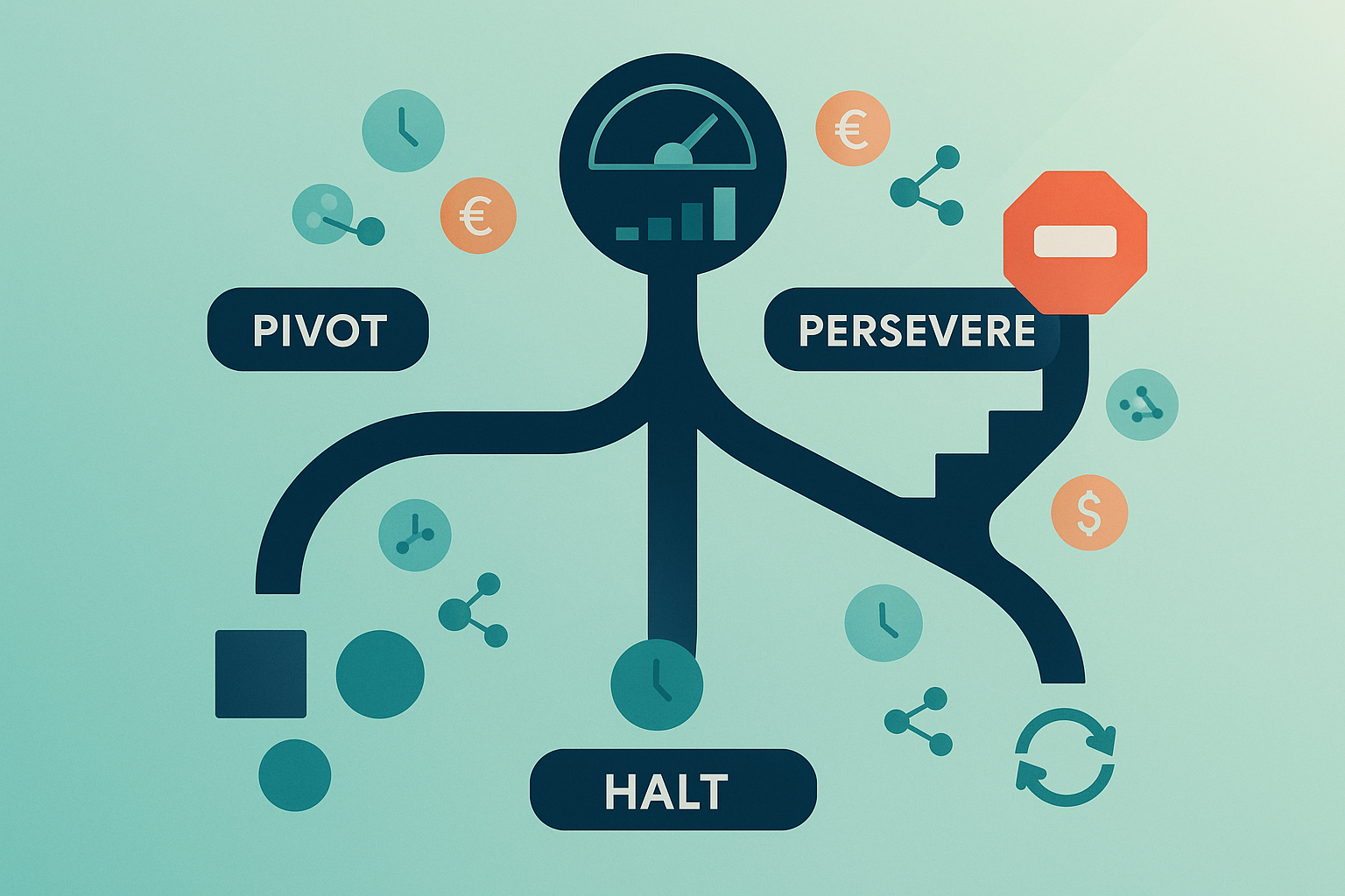
The moment of truth arrives when you must decide whether to double down on a struggling feature, fundamentally reimagine it, or kill it entirely. With $1M already invested and another $1M budgeted, these decisions test your ability to balance sunk cost fallacy against genuine opportunity, emotional attachment against objective analysis, and team morale against business reality.
The framework for making pivot-persevere-halt decisions begins with brutal honesty about current trajectory. If your feature shows 12% adoption after six weeks with declining customer satisfaction, you must project where these trends lead without intervention. Will incremental improvements achieve breakthrough results, or are you polishing a fundamentally flawed concept? The data might whisper uncomfortable truths—that simplification could boost adoption to 18% but never to the 30% you need, or that matching competitor pricing would improve adoption but destroy unit economics. Acknowledging these realities requires setting aside the optimism that helped you champion the feature initially.
Furthermore, understanding the true cost of each option extends beyond simple financial calculation. Pivoting to a simplified version might require three sprints of engineering work, but what's the opportunity cost of those sprints? Persevering with price adjustments might preserve engineering capacity, but how does commoditization affect brand positioning? Halting development frees resources for other initiatives, but what's the impact on team morale and market perception? Your analysis must capture these second-order effects, presenting stakeholders with complete pictures rather than narrow financial models.
Let's examine how this decision-making process unfolds in practice:
- Victoria: The analytics feature is at 12% adoption after six weeks. We've invested $1M already. What's your recommendation?
- Jake: Looking at the data, 73% of users say configuration is too complex. If we simplify the onboarding, we could reach 18% adoption, but that requires three sprints of work.
- Victoria: That's still below our 20% target. What about matching the competitor's pricing instead?
- Jake: We could cut prices 40% tomorrow, but that drops our payback period from 6 months to 14 months. Plus, it positions us as the budget option rather than the premium solution.
- Victoria: And if we kill it entirely?
- Jake: Honestly? The team's eager to move on. We've learned users want simplicity over power. If we apply that insight to our core product instead, we could improve overall retention by 5-7% based on the patterns we're seeing.
- Victoria: So you're recommending we halt and reallocate?
- Jake: Yes. The $1M we spent taught us something valuable. Let's not throw another million at the wrong problem when we could solve the right one with those resources.
This dialogue illustrates how effective pivot-persevere-halt discussions combine data analysis with strategic thinking, acknowledging both quantitative metrics and qualitative factors like team morale and market positioning. Notice how Jake presents each option with its true costs and benefits, enabling Victoria to make an informed decision rather than defaulting to emotional attachment or sunk cost thinking.
The conversation about pivoting often reveals hidden assumptions and constraints that shaped the original failure. Your CFO might resist additional investment until you demonstrate: "We discovered users want accountability, not analytics—a pivot to social features addresses the actual job-to-be-done." Your CTO might support killing the feature if you acknowledge: "The technical debt from rushing this feature is slowing all development—halting gives us space to refactor." These discussions surface perspectives that pure metrics miss, enriching your decision with organizational context that determines feasibility beyond mere desirability.
Additionally, timing these decisions requires balancing patience with urgency. Killing a feature too quickly wastes learnings that emerge over time; waiting too long wastes resources that could drive value elsewhere. You need clear decision triggers established in advance: "If adoption doesn't reach 15% by week 8, we pivot" or "If customer satisfaction drops below 7.0, we halt." These pre-committed decision points prevent the gradual slide into failure where each week seems like insufficient reason to change course until suddenly you've wasted a quarter.
Finally, the execution of your decision matters as much as the decision itself. If you pivot, the team needs crystal clarity about what changes and what remains constant. If you persevere with adjustments, everyone must understand why you believe this time will be different. If you halt, you must harvest learnings and celebrate what the team discovered rather than treating it as failure. The message might be "We learned that users need simplicity more than power—this insight will shape every feature we build going forward" rather than "The Premium Analytics feature failed to meet targets." This framing transforms potentially demoralizing moments into valuable organizational learning that improves future decision-making.
In your upcoming role-play sessions, you'll face the intense pressure of designing dashboards with technical constraints, defending performance gaps to skeptical executives, and making bet-the-company decisions about struggling features. These scenarios will test your ability to measure honestly, interpret data objectively, and advocate for difficult decisions when every option carries significant risk.
