Welcome back! Now that you've trained your Convolutional Neural Network (CNN) model, it's time to evaluate its performance and visualize its predictions. This lesson will guide you through the process of assessing how well your model performs on unseen data and how to interpret its predictions. Whether you're familiar with model evaluation or this is your first time, this lesson will provide you with the knowledge and skills needed to evaluate a CNN model effectively.
In this lesson, you will learn how to evaluate the performance of your CNN model using various metrics. We will cover the steps involved in assessing the model's accuracy and visualizing its predictions. You will also learn how to interpret the results and understand the model's strengths and weaknesses.
Here's a glimpse of the code you'll be working with:
This code snippet demonstrates how to evaluate your model's accuracy and visualize its predictions. You will understand each step and how it contributes to assessing the model's performance.
The classification report is a comprehensive summary of key evaluation metrics for each class in your dataset. It includes precision, recall, F1 score, and support (the number of true instances for each class). This report helps you quickly assess how well your model is performing for each individual class, not just overall.
Here’s how you can generate and display a classification report:
The output will look something like this:
Each row shows the metrics for a specific class, while the averages at the bottom summarize overall performance. This detailed breakdown helps you identify which classes your model predicts well and which may need more attention.
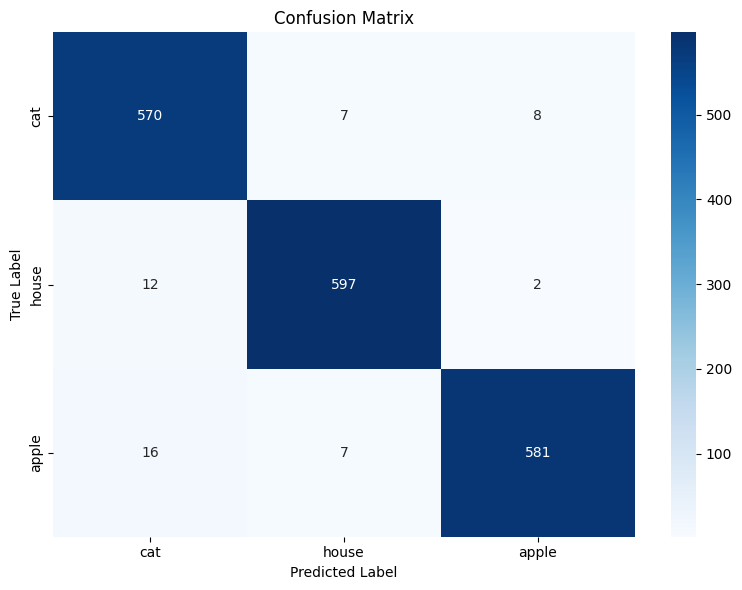
Another valuable tool for evaluating your CNN model is the confusion matrix. A confusion matrix provides a detailed breakdown of your model’s predictions by showing how many times each class was correctly or incorrectly predicted. Each row of the matrix represents the actual class, while each column represents the predicted class.
- Diagonal elements (from top-left to bottom-right) show the number of correct predictions for each class.
- Off-diagonal elements indicate misclassifications, showing where the model confused one class for another.
This matrix helps you identify specific classes your model struggles with, which is especially useful for multi-class problems like sketch recognition.
To make the confusion matrix easier to interpret, you can visualize it as a heatmap. A heatmap uses color intensity to represent the values in the confusion matrix, making patterns and problem areas stand out visually.
Here’s how you can compute and visualize the confusion matrix as a heatmap:
By analyzing the confusion matrix and its heatmap, you can quickly spot which classes are most often confused with each other. This insight can guide you in refining your model or dataset to improve overall performance.
Here is an example of how the heatmap might look like:
Evaluating a CNN model is a crucial step in the machine learning process. It allows you to measure the model's accuracy and identify areas for improvement. By mastering the evaluation process, you will be able to create models that can reliably recognize and classify images. This skill is essential for developing robust AI systems and advancing research in machine learning.
Are you excited to see how well your model performs? Let's dive into the practice section and start evaluating your CNN model for sketch recognition!
