Find Missing Context
Introduction 🎉
Welcome back to Decode How Risk Gets Framed! In the first two lessons of this course, you learned to translate between absolute and relative risk so that dramatic-sounding claims could be grounded in real numbers, and you practiced telling percentage points apart from percentage change. This lesson stays with the theme of how claims are presented, but turns to something even more fundamental: the information that a claim leaves out entirely.
A statistic can be perfectly accurate and still deeply misleading if it withholds the context you need to interpret it. No amount of careful math helps if the key numbers were never given to you in the first place. In this lesson, you will learn to:
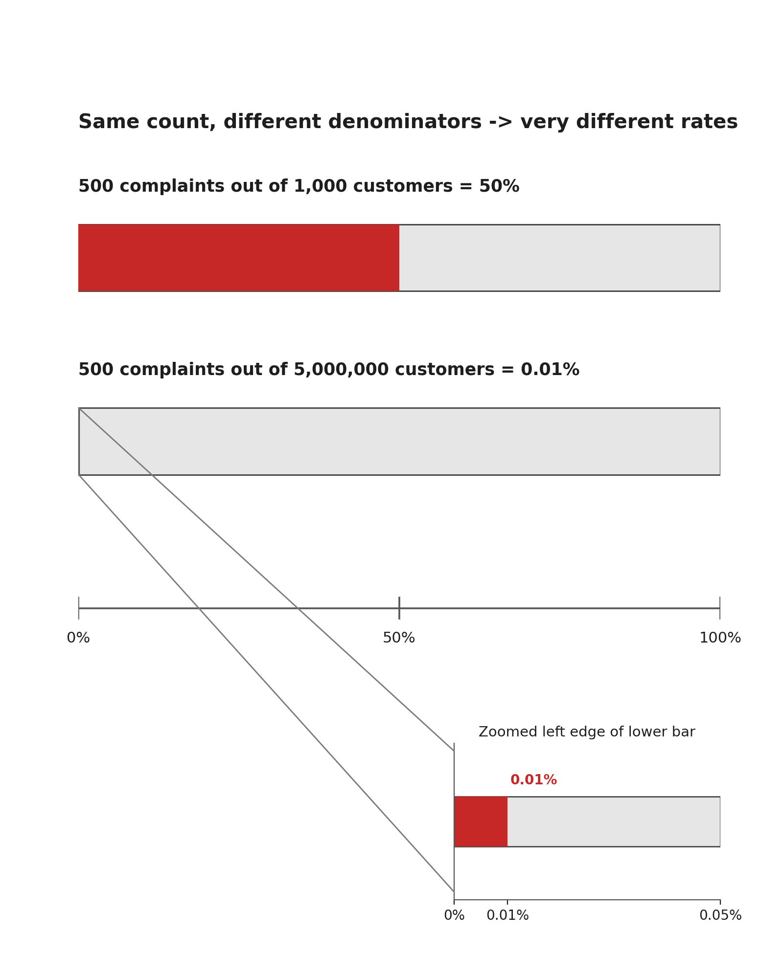
- Spot missing denominators by asking what total a count or percentage is measured against, since the same number can signal a crisis or a triviality depending on the group it comes from.
- Uncover hidden baselines by checking whether the starting value behind a reported change is stated and representative, because a change is only as meaningful as the point it grew from.
- Detect cherry-picked time windows by questioning whether the chosen start and end dates are reasonable, since shifting the window can flip a trend from impressive to disappointing.
Imagine someone tells you, "Our new safety program cut workplace injuries by 50%." That sounds impressive. But notice what you don't know: How many injuries were there before? Over what time period? How many employees are we talking about? Did the comparison start right after an unusually bad year?
Without those answers, the 50% figure floats in midair. As you saw in earlier lessons, relative changes depend heavily on the baseline. A 50% reduction could mean going from 200 injuries to 100, or from 4 injuries to 2. The first scenario reflects a sweeping improvement; the second might just be normal fluctuation.
The habit you want to build is simple: before accepting any claim, ask "What's missing?" Let's look at the three most common gaps, starting with the one that hides in plain sight.
Missing Denominators 🔍
Hidden Baselines 📉
A baseline is the starting value from which a change is measured. Both relative risk and percentage change depend entirely on where the numbers began. When a claim hides the baseline, you cannot tell whether the reported change is large or small in practical terms.
Suppose a supplement company advertises: "Energy levels improved by 40% in our clinical study." Without knowing the baseline measurement and scale, that 40% is uninterpretable. If "energy" was scored on a 10-point scale and participants went from 5.0 to 7.0, that is a noticeable gain. If they went from 0.5 to 0.7, it may not be perceptible at all.
In both cases the relative change is 40%, yet the real-world meaning is completely different. A hidden baseline can also disguise a recovery rather than genuine growth. If a store's revenue dropped sharply last year and then bounced back, reporting the bounce as "revenue grew 30%" makes ordinary recovery sound like exceptional performance. Always ask: grew compared to what, and was that starting point typical?
Even when the denominator and the baseline are both visible, a claim can still mislead through a subtler trick: choosing when to start and stop the clock.
Cherry-Picked Time Windows 🍒
The third type of missing context involves the time window a claim uses. By carefully selecting when to start and when to stop measuring, almost any trend can be made to look positive or negative.
Imagine a company's stock price over five years follows this path:
| Year | Price |
|---|---|
| Year 1 | $80 |
| Year 2 | $120 |
| Year 3 | $60 |
| Year 4 | $90 |
| Year 5 | $100 |
An optimistic press release might highlight that the stock rose from $60 in Year 3 to $100 in Year 5. At the same time, a more skeptical observer might point out that the stock was already worth $120 in Year 2. Both of these statements are true. The difference comes from where the story begins.
Same stock price. Three different stories. Whenever a trend claim includes dates, you should ask two questions:
- Is the start date unusually high or low? A peak start makes growth look weak; a trough start makes it look strong.
- Would a longer or different window tell a different story? If shifting the window by a year reverses the conclusion, the original framing was fragile.
This tactic appears frequently with crime statistics, weather records, fund performance, and sales figures. The numbers themselves are not false, but the chosen frame can create an impression that the full picture would not support.
A Missing-Context Checklist 📋
You now have three specific gaps to watch for. Combining them into a short mental checklist makes the habit easy to apply whenever we encounter a new claim:
- Denominator check. Is a total or group size provided? If not, the count or percentage cannot be evaluated.
- Baseline check. Is the starting value stated and representative? If not, the reported change could be exaggerated or trivial.
- Time-window check. Are the start and end dates reasonable and not suspiciously chosen? If not, the trend may reverse under a different window.
If any one of these checks fails, the claim deserves skepticism until the missing piece is supplied. This does not mean the claim is wrong — it means you simply cannot tell yet.
Conclusion and Next Steps
In this lesson, you explored three ways that risk claims can mislead by leaving out essential context: missing denominators strip away the totals needed to judge a count, hidden baselines obscure whether a reported change is meaningful, and cherry-picked time windows let the presenter manufacture favorable trends from neutral or even negative data. The core skill is the same in each case: pause before reacting and ask what information is absent.
Up next, you will put this skill to work in a set of practice tasks where you will evaluate headlines for completeness, match incomplete claims to the specific numbers they need, detect manipulated time windows, and challenge a dramatic news claim in a realistic conversation. Let's see how sharp your missing-context radar has become!