After your initial inspection of the podcast dataset using methods like .info() and .describe(), it's time to use data visualization to uncover deeper patterns and relationships. While summary statistics are useful, visualizations can quickly reveal trends, outliers, and feature relationships that numbers alone might miss.
In this lesson, you'll use two key Python libraries:
- Matplotlib: The foundational plotting library in Python.
- Seaborn: A higher-level library for more attractive and informative plots.
You'll learn to create three essential EDA visualizations:
- Histograms: To see the distribution of individual numerical features.
- KDE plots: For a smoother view of feature distributions.
- Correlation heatmaps: To visualize relationships between numerical features.
In this lesson, we'll use the full dataset for visual exploration so you can focus on understanding patterns in the variables themselves. Later, when we move into preprocessing and modeling, we'll introduce train/test splits to evaluate models fairly on unseen data. Keeping those phases separate helps build a clean workflow: first understand the data, then prepare it, then model it.
Understanding which features are numerical or categorical is crucial for effective feature engineering—the process of selecting, transforming, or creating new features to improve model performance. Visualizing distributions and relationships helps you:
- Detect outliers and skewed features that may need transformation.
- Identify redundant or highly correlated features to avoid multicollinearity.
- Spot patterns that can inspire new, more predictive features.
By mastering these visualization techniques, you'll be better equipped to clean, preprocess, and engineer features, setting a strong foundation for building effective machine learning models.
Numerical features are columns that contain quantitative values—numbers you can perform mathematical operations on, such as addition or averaging. In the context of the podcast dataset, these might include things like episode length, popularity percentages, or the number of ads.
To systematically identify numerical features, use pandas’ select_dtypes method with np.number:
Example output from the podcast dataset:
These features are suitable for visualizations like histograms, KDE plots, and correlation heatmaps, which help you understand their distributions and relationships.
Categorical features represent qualitative values—labels or categories that describe qualities or groupings, such as podcast genre or publication day. These are typically stored as strings or objects in your dataset.
To identify categorical features, use select_dtypes with 'object':
Example output from the podcast dataset:
Categorical features are best explored with bar charts or count plots, which help you see the frequency of each category and spot any imbalances or rare values.
By clearly separating numerical and categorical features, you can choose the most effective visualization and analysis techniques for each type, making your EDA more insightful and targeted.
Once you've identified your numerical features, the next step is to visualize their distributions. This helps you:
- Spot outliers
- See if features are skewed or normally distributed
- Decide if preprocessing (like normalization or transformation) is needed
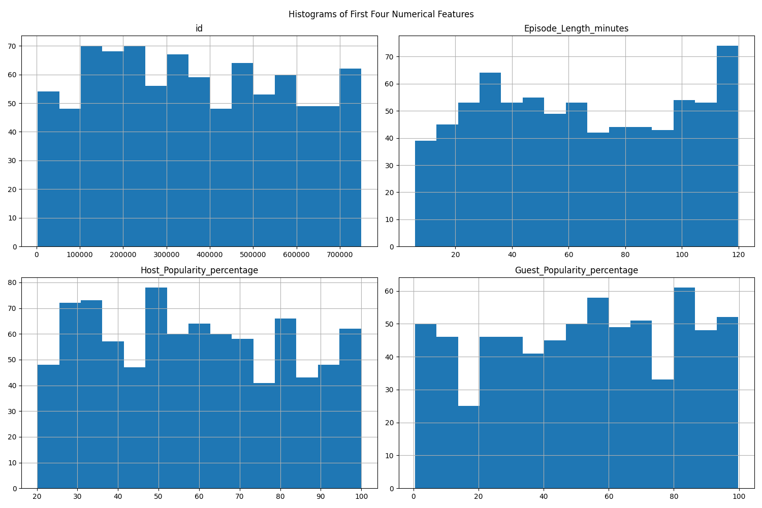
Histograms are a fundamental way to visualize the distribution of numerical features. You can plot all numerical features at once, or focus on a subset (such as the first four features).
A histogram divides the range of a numerical feature into intervals called "bins" and displays how many data points fall into each bin. The x-axis shows the value ranges (bins), and the y-axis shows the frequency (count) of data points in each bin. The height of each bar represents the number of observations within that interval.
What histograms reveal:
- Central tendency: Where most values are concentrated.
- Spread: How widely values are distributed.
- Skewness: Whether the data is symmetric or skewed to one side.
- Outliers: Bins that are far from the main cluster with a small number of data points.
- Modality: Whether the distribution has one peak (unimodal), two peaks (bimodal), or more.
By examining histograms, you can quickly spot if a feature is skewed, contains outliers, or is approximately normal, which can inform your preprocessing and modeling decisions. For example, a heavily right-skewed feature may benefit from a transformation later, while a very wide spread or isolated bars can signal unusual values worth investigating before modeling.
Example:
If you want to focus on just a few features (e.g., the first four), you can do:
To get a more detailed view, you can combine histograms and KDE (Kernel Density Estimation) plots. This allows you to see both the frequency (histogram) and the smoothed distribution (KDE) for each feature.
A KDE (Kernel Density Estimation) plot shows a smooth curve that represents the distribution of your data. Unlike a histogram, which uses bars and bins, a KDE plot draws a continuous line to show where values are concentrated. KDE works by placing a small, smooth curve at each data point and adding them up to make one overall smooth line. The "bandwidth" controls how smooth the line is—a smaller bandwidth follows the data closely (more wiggly), while a larger one makes the curve smoother.
A common approach is to use subplots to show several features at once:
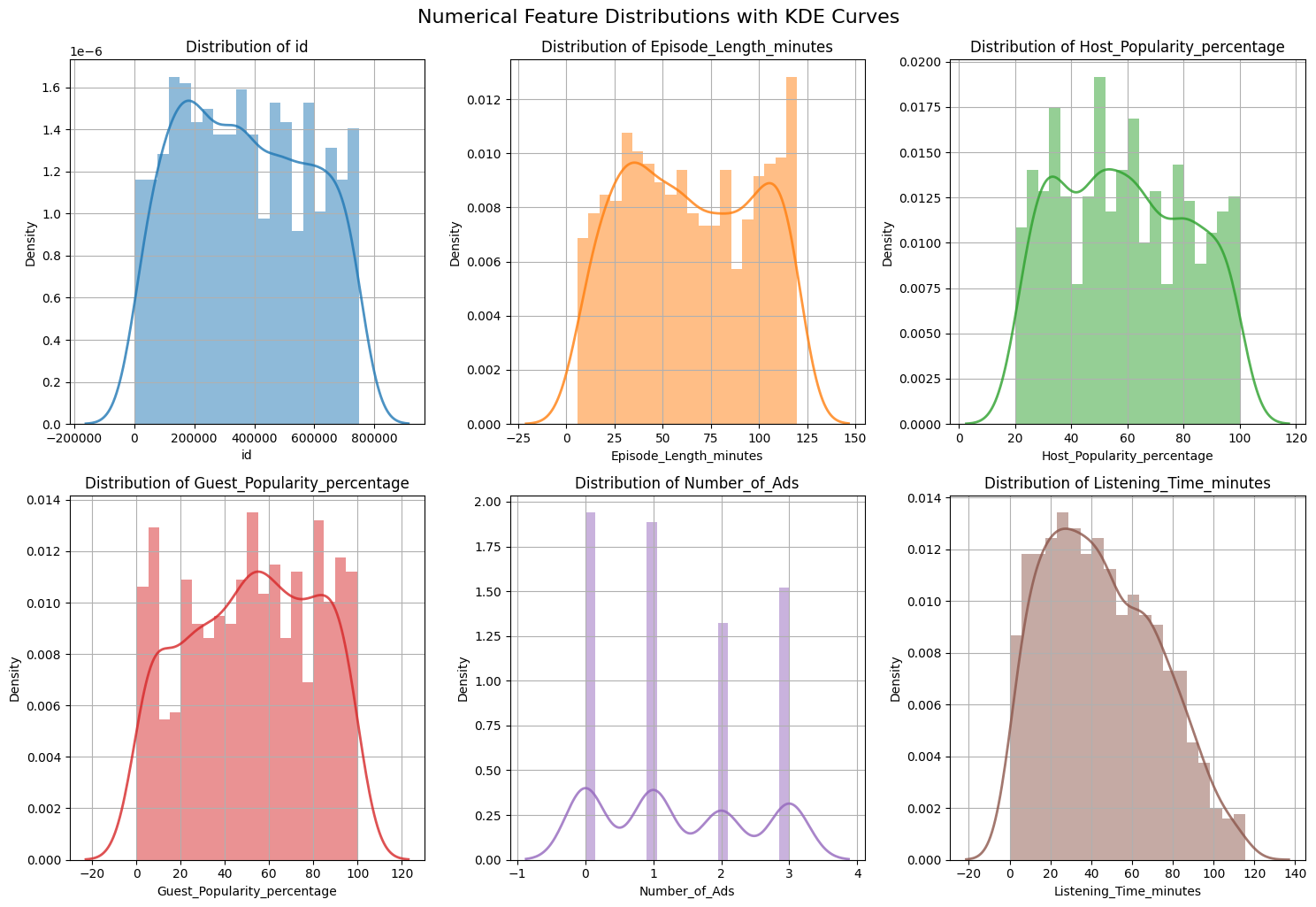 What to look for:
- Skewness: Is the distribution symmetric or skewed?
- Outliers: Are there values far from the main cluster?
- Modality: Is there one peak or multiple peaks?
KDE curves are especially helpful when comparing the overall shape of a distribution across features, because they smooth out the jagged look that histograms can have when the bin size changes. It is still important to remember that KDE is an estimate: the exact shape can vary depending on the amount of data and the smoothing bandwidth.
To understand how numerical features relate to each other, use a correlation heatmap. This visualization helps you quickly see which features are strongly related, which can inform your feature selection and engineering decisions. For example, you can:
- Identify redundant features that are highly correlated with each other (which can cause issues like multicollinearity in modeling).
- Spot features that may be strong predictors of your target variable.
- Detect groups or clusters of features that move together.
What is correlation?
Correlation measures how strongly two numerical features move together. It ranges from -1 to 1:
- A value of 1 means a perfect positive relationship (as one feature increases, the other also increases).
- A value of -1 means a perfect negative relationship (as one feature increases, the other decreases).
- A value of 0 means there is no linear relationship between the features.
Basic correlation heatmap:
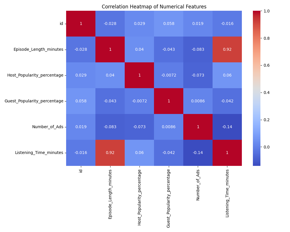 By default, a correlation matrix is symmetric: the value at (A, B) is the same as at (B, A). This means the heatmap will show the same information above and below the diagonal, which can be visually redundant.
To make the heatmap easier to read, you can display only the lower triangle of the matrix. This removes the duplicate information and helps you focus on the unique pairs of features.
Lower triangle heatmap (to avoid redundancy):
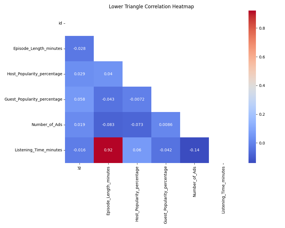 When reading a correlation heatmap, look for values close to 1 or -1, which indicate strong positive or negative relationships between features. Pay special attention to features that are highly correlated with your target variable, as these may be strong predictors. Also, notice if there are clusters of features that are all highly correlated with each other—these may be redundant and could be candidates for dimensionality reduction or feature selection.
At the same time, keep two important limits in mind:
- Correlation does not imply causation. Two features can move together without one causing the other.
- Correlation mainly captures linear relationships. Two variables may have a strong non-linear relationship even when their correlation is close to zero.
In this lesson, you learned how to:
- Identify numerical and categorical features using
pandas - Visualize distributions with histograms and KDE plots (including combined plots)
- Analyze feature relationships with correlation heatmaps (including lower triangle masking)
In the upcoming practice, you'll apply these skills to the podcast dataset by creating and customizing visualizations, identifying skewed features and outliers, and using correlation analysis to find strong predictors of listening time. These techniques will help you quickly uncover and communicate key data patterns, setting you up for effective data cleaning and modeling.
