Welcome to Flexbox! You've mastered the box model, but how do you easily arrange multiple boxes on a page? Flexbox is a modern CSS layout model that makes it incredibly easy to align and distribute items in a container.
Engagement Message
What's one layout challenge, like centering something, that you've found difficult?
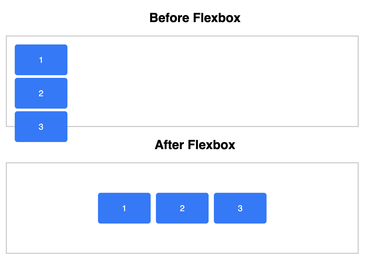
To use Flexbox, you apply display: flex; to a parent element, which is called the flex container. All direct children of that element automatically become flex items.
This single line of CSS transforms how the child elements are arranged.
Engagement Message
Can you think of a situation where you'd want to group several elements together and control their layout as one unit?
By default, once you apply display: flex;, all flex items will try to line up in a single row from left to right. This is a powerful way to place elements side-by-side without complicated tricks.
This horizontal arrangement is controlled by the flex-direction property, which is set to row by default.
Engagement Message
What do you think would happen if you wanted items to stack vertically instead of horizontally?
To control horizontal alignment and spacing, you use the justify-content property on the flex container. Use justify-content: center; to center items horizontally in the middle of the container.