Interpreting and Analyzing Images with Claude
Introduction: Adding Visual Feedback to Your Workflow
In the previous lesson, you discovered Claude's agentic capabilities—how it autonomously creates files, executes code, and verifies results. You watched Claude generate complete data visualizations by writing Python scripts, running them, and confirming the output files were created successfully.
Creating a plot is just the beginning. The real challenge in data visualization is evaluating whether your plot effectively communicates your data. Does the color scheme work? Are the axes labeled clearly? Is the data pattern visible? These questions require visual judgment—you need to actually look at the plot and assess its quality.
This is where Claude's visual analysis capabilities become essential. Claude doesn't just create visualizations blindly—it can examine the images it produces, describe what it sees, identify potential issues, and suggest specific improvements. In this lesson, you'll learn how Claude can analyze visualizations using the Read tool with image files in your project directory.
Using the Read Tool with Image Files
The Read tool works identically with image files as it does with code files—Claude can examine PNG, JPG, and other image formats just as easily as it reads Python scripts. Let's see this in action with the first_plot.png file you created in the previous lesson:

Ask Claude to describe this image:
Claude uses the Read tool to examine the image:
Notice the level of detail in Claude's analysis. Claude identifies the title, describes both axes with their ranges, explains the data pattern (linear relationship with a slope of 1), notes the styling elements (blue line, gray grid), and even recognizes the library used to create it. The Read tool shows you exactly what it's doing—you see Read(first_plot.png) followed by confirmation that it read a 20.1KB image file.
Creating a Visualization for Analysis
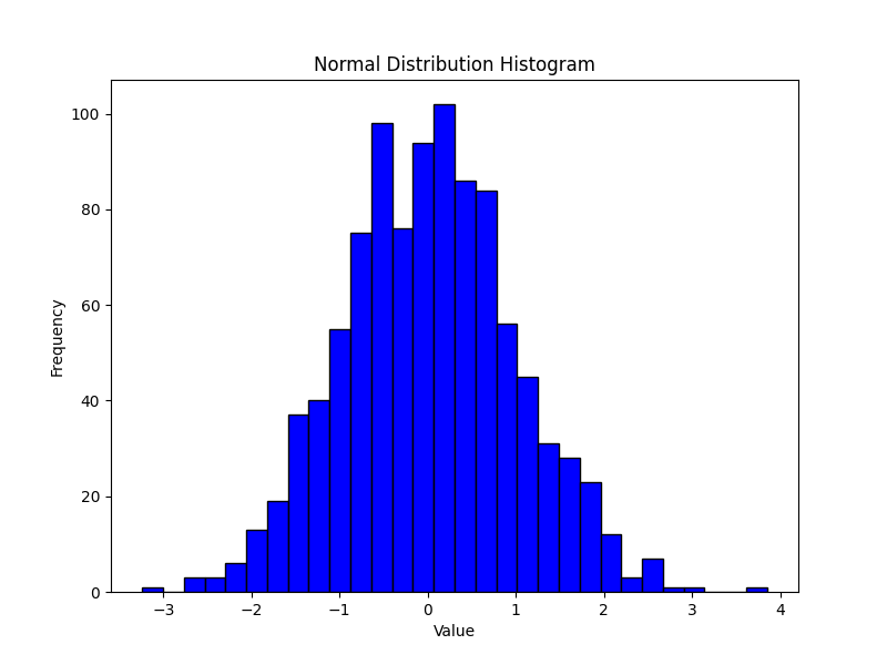
The real power of Claude's visual analysis emerges when you combine it with Claude's code generation capabilities. You can create a visualization, have Claude examine it, discuss what could be improved, and then have Claude modify the code based on what it observed. Start by asking Claude to create a basic histogram:
Claude generates the code and creates the visualization:
Here's what Claude created:
Having Claude Analyze Its Own Work
With the histogram created, you can now ask Claude to critically evaluate its own work. This is where Claude's visual analysis becomes particularly valuable—it can identify areas for improvement that might not be obvious from the code alone:
Claude reads and evaluates the image:
Claude doesn't just describe what exists—it identifies specific opportunities for improvement based on data visualization best practices.
Implementing Improvements Based on Visual Feedback
Now ask Claude to implement these improvements:
Claude modifies the code based on its visual analysis:
Here's the improved histogram with all enhancements applied:
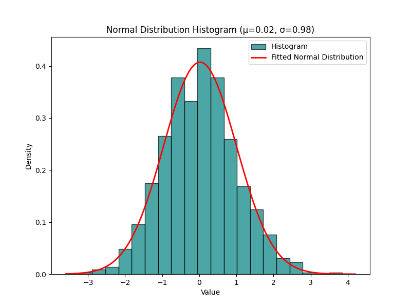
Notice the complete workflow Claude executed autonomously. Claude read the existing code, made surgical modifications to implement all five improvements, ran the updated script, and then read the new image to verify the changes were successful. You can continue this process for as many iterations as needed, describing what you observe or what you'd like changed, and Claude modifies the code accordingly.
Summary: Your Visual Analysis Partner
You've just learned that Claude can do more than create visualizations—it can analyze them. The Read tool allows Claude to examine image files in your project directory with comprehensive visual analysis, where Claude describes titles, axes, data patterns, colors, styling, and identifies specific opportunities for improvement.
This capability enables an iterative refinement workflow. You can ask Claude to create a visualization, have Claude examine what it produced, discuss potential improvements, and then have Claude modify the code based on its visual observations. As you move into the practice exercises, you'll experience this workflow firsthand. Pay attention to how Claude's observations translate into specific code modifications.
