You've mastered statistical analysis from our previous sessions. Now let's transform those insights into compelling visualizations that actually drive decisions.
Advanced chart selection isn't about fancy graphics - it's about matching your analytical question to the perfect visual answer.
Engagement Message
What is one quality that transforms a good chart into a great chart?
Remember when we analyzed time series patterns? A simple line chart works, but what if you need to compare multiple products across different time periods simultaneously?
This is where advanced visualizations become game-changers. They reveal complex patterns that basic charts miss completely.
Engagement Message
Recall a time a basic chart felt insufficient—what was missing?
Let's start with heatmaps - they're perfect for showing relationships between two categorical variables. Think website clicks by hour and day of week.
[Include this image. Do not include this text]
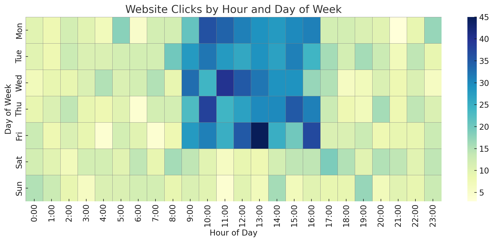
Instead of reading through tables of numbers, heatmaps use color intensity to instantly highlight your busiest periods.
Engagement Message
What is one business question that could be answered faster with a heatmap?
Small multiples (also called panel charts) show the same chart type repeated for different categories. Imagine sales trends for each product line displayed side by side.
[Include this image. Do not include this text]
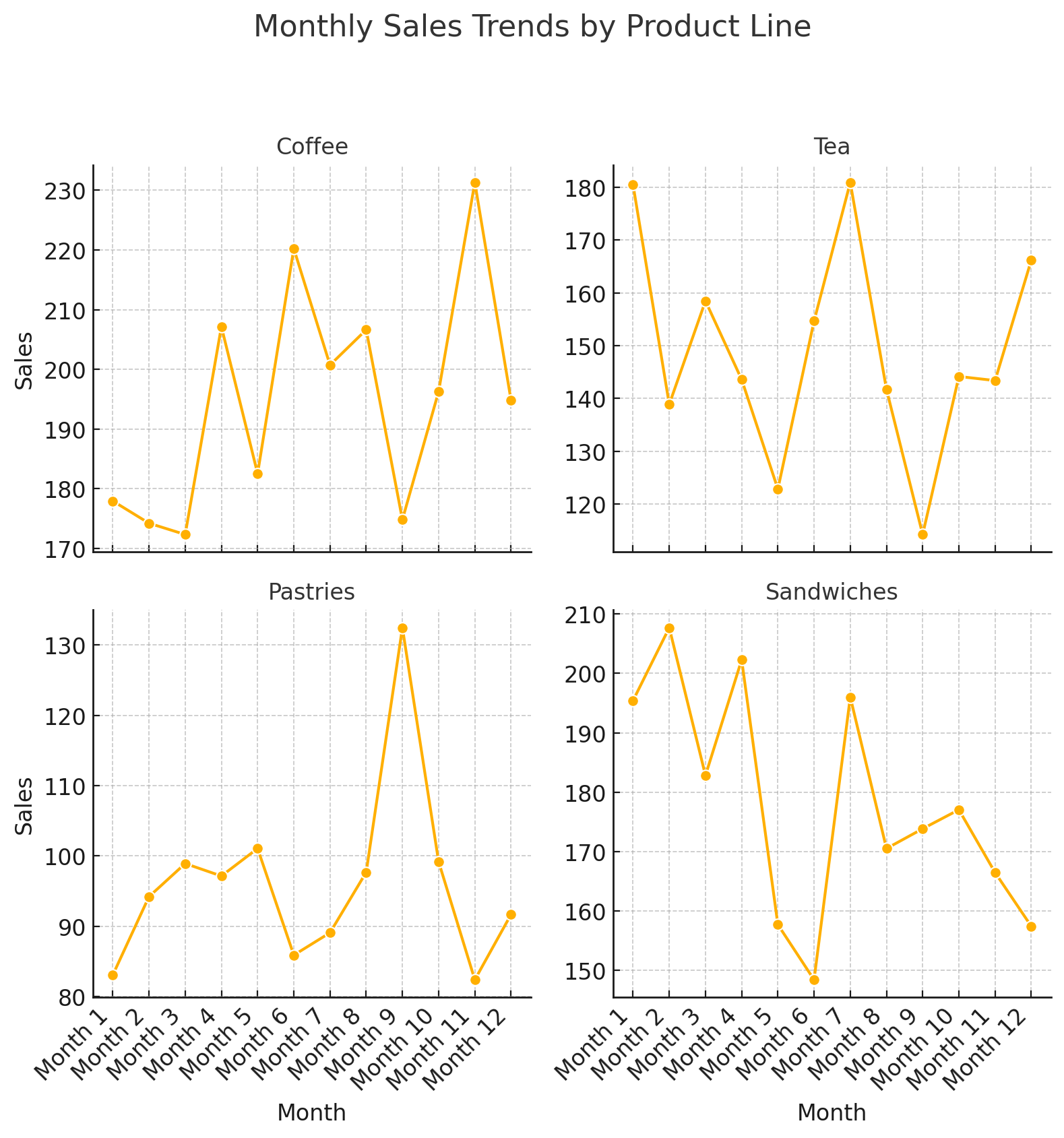
This lets you spot both individual patterns and compare across categories simultaneously.
Engagement Message
How might comparing multiple trend lines help your decision-making?

.png)