Prompting Image Generation Clearly
From Reading Images to Making Them 🎯
Reading images is one half of the job. The other half is making them. When you ask AI to generate an image, the model is guessing at thousands of choices you didn't make: where the camera sits, who's in the shot, what time of day it is, what the space looks like, whether it reflects your actual team and users or a generic stock cliché. Leave those choices to chance and you get a vaguely-stock-photo result that's off-brand, doesn't fit the design-review deck or the case-study cover, and — worst case — depicts your team or your users in a way that's stereotyped or inauthentic. This unit gives you a structure for making those choices on purpose.
By the end of this lesson, you'll be able to:
- Apply the Image Prompt Anatomy to specify Subject, Style, Composition, Mood/Lighting, and Constraints.
- Translate a design communication goal — a design-review hero, a case-study cover — into a concrete, photographable scene.
- Refine the prompt by tightening specificity and exclusions after reviewing the first batch.
Apply the Image Prompt Anatomy 🦴
The Image Prompt Anatomy is a five-part checklist for what to put into an image prompt: Subject, Style, Composition, Mood/Lighting, and Constraints. If any one is missing, the model fills the gap with whatever its training data suggests, which is usually a cliché that looks nothing like your team or your product.
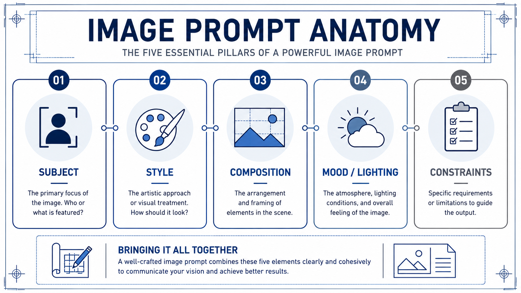
- Subject is what is literally shown: who or what is in the frame, doing what.
- Style is the visual treatment: photo, line illustration, 3D render, or a reference to your team's known look. This is where brand and authenticity live.
- Composition is how the shot is framed: close-up or wide, eye-level or overhead, centered or off-axis, and crucially where the negative space sits for a slide title or headline.
- Mood/Lighting sets atmosphere: warm and optimistic, cool and clean, grounded and natural.
- Constraints are the guardrails: aspect ratio (16:9 for a wide slide), exclusions (no readable text, no fake logos, no stereotyped or tokenized depictions of people), and any must-haves like a safe area for the title.
Run through all five every time, even when one feels obvious. "Obvious" is exactly where models default to the average — and average is off-brand and often stereotyped.
Here's how the checklist works in practice. Milo, an art director from the in-house creative team, is helping product designer Natalie turn a vague design-review idea into a usable prompt before opening the image tool:
- Milo: What's the subject?
- Natalie: Our users, at the center of everything.
- Milo: That's a theme, not a subject — and "at the center" is going to get you one person literally standing in a ring of people holding hands. Be specific. Who's in the shot, where, doing what?
- Natalie: A small design team mid-critique around a monitor showing a wireframe, one designer pointing at the screen, another sketching a user flow on a whiteboard, candid, not posed.
- Milo: Better. Now style, composition, lighting, constraints. Skip any of those and you'll get the stock-photo version, plus we'll have to fight clichés and a title that won't sit anywhere.
Notice Milo's pressure isn't on creativity, it's on specificity. A vague subject equals a vague, off-brand, easily-stereotyped output.
Draft a Prompt from a Communication Goal 🥅
A prompt starts with the communication goal, not the image. Ask yourself: what does this image need to do, and where will it live? Anchor the opening slide of a design review? Set the tone on a case-study cover in the design portfolio? Headline an internal design-system announcement? The goal and the placement tell you the constraints before you touch subject or style.
Once you know the goal, translate the theme into a concrete scene. "User-centered design" is a theme, not a subject; a model can't draw a theme. Push it into something you could photograph: a small design team mid-critique around a monitor showing a wireframe, a designer observing a participant during a usability test, a designer sketching a user flow on a whiteboard while a teammate points at a laptop. Pick one. Then layer the other four anatomy elements on top, tuned to how your team and your work actually look.
When you plan, it helps to jot each anatomy element in its own labeled slot (as the practice worksheets do); when you write the final prompt to paste in, fold those slots into one block of clear sentences rather than leaving them as a bare list of tags. Something like: a wide-angle, documentary-style photograph of a small, genuinely diverse design team mid-critique around a monitor showing a wireframe, one designer gesturing at the screen while another sketches a user flow on a whiteboard; warm, focused natural light; grounded and authentic, not posed; 16:9 with clear empty space across the top third for a slide title; no readable text or legible UI, no fake product logos, no stereotyped or tokenized depictions of the team, no literal "user-centered design" metaphors like giant lightbulbs or people holding hands in a circle. That's all five elements, on purpose, on brand, in one paragraph.
Refine by Tightening Specificity and Exclusions 🔧
Your first batch will almost never be the one you ship. Treat it as a diagnostic. Look at what's off and trace it back to an anatomy element. Faces look uncanny or airbrushed? Tighten Style ("documentary photo, natural skin texture") or add an exclusion ("no airbrushed faces, no warped hands"). People feel like generic stock or lean on a stereotype? Subject is still too abstract, or you're missing an exclusion for authentic, non-tokenized representation. Title won't fit? You forgot a safe-area Constraint. Wrong shape for the slide? You skipped the aspect-ratio Constraint.
Before you decide whether a batch is usable, run it through a quick Responsible Visual Review: check accessibility and readability (contrast, legibility, a safe title area), stereotypes and representation (avoid biased or clichéd depictions of people), misleading realism (does it imply a real user, event, or product screen that doesn't exist?), false evidence and fake text (no invented logos, garbled UI, or fabricated data), and disclosure (does the use context need an "AI-generated / illustration" label?). Run this lens before you make a ship / revise / kill call, not after.
The move is targeted edits, not rewrites. Change one or two elements, regenerate, compare. Keep a short, reusable exclusions list you add every time (no readable text, no warped hands, no fake logos, no stereotyped or tokenized depictions of people, no literal metaphors), plus your standard aspect ratio and safe area for slides.
The throughline of this unit: a usable design image prompt is a deliberate set of five choices that match your brand and your placement, not a wish. Vague in, generic out; specific and authentic in, slide-ready out.
The test of any of this is whether it holds up live, so the next step is a conversation with a design partner where you'll walk through each anatomy element for a real design-review hero before you ever open the tool. Bring a concept that's already concrete, and expect to leave the call with it sharper, more on-brand, and free of clichés.
