Reading Images with Vision AI
Welcome to the Course 🚀
Welcome to AI Images for Workplace Communication. Images show up across analyst work: a chart export on the analytics-team wiki, a hero slide behind the opening of a quarterly business review (QBR), a KPI card in a monthly metrics report, an infographic in a stakeholder update, a dashboard screenshot a stakeholder pasted into Slack with "what's going on here?!" Generative AI now lets you describe, create, and edit those images in seconds — which means the bottleneck has shifted from "can I make this?" to "should I share this, and does it say what I think it says about our data?" This course gives you the moves to handle both ends responsibly.
By the end of this lesson, you'll be able to:
- Request structured image descriptions from vision AI for a specific analytics purpose like wiki alt text, meeting prep, chart-interpretation triage, or chart reading.
- Separate what an image actually shows from what AI (or you) is guessing about it, so an inference never becomes a stated fact in a stakeholder update.
- Turn a clean description into a usable analyst deliverable like accessible alt text, inventory notes, accessible documentation, or a stakeholder chart-interpretation update.
Before You Begin: Safety
Course readiness: use only synthetic, sample, or explicitly approved non-sensitive images for every practice. Never upload a dashboard, chart export, or screenshot containing real customer PII, production data, credentials, connection strings, or confidential business figures into a general AI tool. Use sample, synthetic, or de-identified charts and dashboards instead. If you don't have image-capable access, you can still complete the work by writing and reviewing the prompts and briefs against the frameworks, using described or stock sample images instead of generating your own.
Before any AI-assisted analytics task, use the Data Analyst AI Safety Checkpoint:
- Approved tools: use approved tools only.
- Data minimization: never paste production data, customer PII, credentials, connection strings, or confidential business figures; use synthetic, sample, or de-identified inputs.
- Source verification: treat any AI-read number or trend as unverified until validated against the real schema/data.
- Human review: review AI-assisted outputs before use.
- Escalation: route regulated, PII, or financial-reporting matters to the appropriate data owner or governance function.
- Recordkeeping: the data warehouse, the BI tool, and versioned query repos are the source of truth; AI chats are not a system of record.
One boundary governs this whole skill: a chart screenshot is a picture of the data, not the data itself — anything the picture "shows" about cause has to be confirmed against the source table, not accepted from the image. For practice, you always work from a synthetic or sample chart screenshot that stands in for the real thing, so you can build the skill safely.
Asking Vision AI for the Right Kind of Description 🔍
Vision AI is the family of models that can "look at" an image you give it and describe it in words. The trap is treating it like a one-size tool. A generic prompt like "what's in this image?" gives you a generic answer: a wall of detail, half of which you don't need, with no structure you can paste into an alt-text field, a meeting note, or a stakeholder update.
The fix is to name the purpose upfront. Different analytics jobs need different shapes of description:
- For alt text (the text a screen reader announces for a chart on the analytics wiki or intranet), you want a tight, neutral sentence focused on visible content.
- For meeting prep, you want a plain inventory of what's literally in a slide or chart before you summarize it.
- For chart-interpretation triage on something like a dashboard screenshot a stakeholder sent over, you want the visible chart elements separated cleanly from any guess about cause, trend explanation, or whether a result is "good."
- For chart interpretation on a screenshot of a revenue, headcount, or KPI chart, you want the chart type, axes, units, the trend, and the highest/lowest values called out.
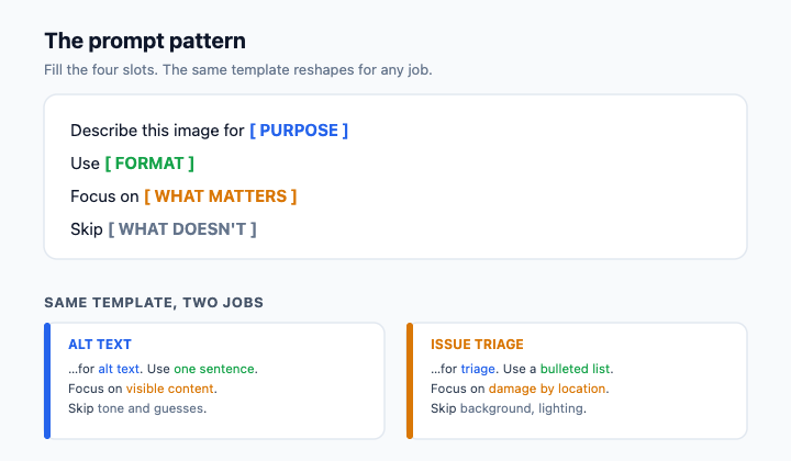
A reliable prompt pattern looks like this: Describe this image for [purpose]. Use [format]. Focus on [what matters]. Skip [what doesn't].
For a chart headed to the analytics wiki, you might write: Describe this image for alt text on our analytics wiki. Use one neutral sentence plus a short bullet list. Focus on the chart type, axes, labels, and relative magnitudes actually visible. Skip any guesses about why the numbers moved or whether the result is good or bad. You've now turned a vague request into something you can act on.
Telling Observation Apart from Interpretation ⚖️
Here is the single most important habit in this unit, and it's where analysts get burned: vision AI will hand you observations and interpretations mixed together, in the same confident tone — and an interpretation that slips into a stakeholder update can become a conclusion about cause that nobody can stand behind from a picture.
An observation is something visible in the pixels: "The bar for week 3 is roughly half the height of the bar for week 2." An interpretation is a guess about cause or meaning: "Revenue dropped because of churn." An unsupported assumption goes further: "The team is behind target." Only the first kind is safe to build on. The other two add an explanation or judgment that the visible chart does not directly support — and in a stakeholder note, "revenue fell because of churn" reads as a causal claim you'd have to prove by querying the underlying data, not by reading the screenshot.
Watch for neutral inference language such as "appears to," "looks like," "seems to," and "suggests that." These phrases signal that wording needs to be checked against the visible facts, as do causal claims and unsupported judgments the image cannot directly establish.
Here's how that filtering sounds when a peer reviewer catches it:
- You: The vision AI says it's "revenue falling because of churn, and the team is behind target." That's useful for my stakeholder note, right?
- Dan: What does the chart actually show?
- You: The week-3 bar is about half the height of week 2, and there's no target line on the axis.
- Dan: Then say that. "Because of churn" and "behind target" are a story — a cause and a judgment. If we put that in the note, we've decided why the number moved from a screenshot we can't back up.
- You: Fair. I'll keep the note to the visible shape and flag that cause isn't determinable from the image — I'd query the table to confirm before anyone briefs leadership.
Notice Dan isn't rejecting AI, he's rejecting AI-shaped fiction dressed up as fact. Your job is to be the human filter between the description and whatever the team records or acts on next — especially when a stakeholder is about to make a decision on it.
Turning a Clean Description Into Something Useful 🛠️
Once you've stripped a description down to observations, you can shape it into the deliverable you actually need — but the deliverable depends entirely on which workflow you're in, and the two must never be mixed.
For non-sensitive, approved images (a synthetic sample chart, a stock office scene, or a chart cleared for the analytics wiki), a clean observation set becomes alt text: concise, neutral, and focused on visible chart content so teammates using screen readers get a faithful description. Put any necessary additional detail in nearby text or a linked description. It can also become inventory notes, accessible documentation, or a stakeholder update.
For a stakeholder chart-interpretation update, the same observation discipline produces a note that states the visible shape of the chart, names explicitly what is not determinable from the screenshot alone (the cause of the movement, whether it's a real change or a data-quality artifact, whether it's on or off target), and recommends one concrete next step like "query the underlying table to confirm the week-3 dip isn't a pipeline gap before we brief leadership." The discipline is the same in every format: say what you can see, name the gaps out loud, and never let a confident sentence become a conclusion about the business just because it sounded authoritative.
The throughline of this unit: vision AI gives you a draft, not a verdict, and the value you add is sorting signal from story before anything reaches a stakeholder. With that in mind, the next step is a live conversation: you'll walk a peer reviewer through an AI description of a synthetic dashboard screenshot and defend, line by line, which sentences are observations you can act on and which are interpretations you need to strip.
