Prompting Image Generation Clearly
From Reading Images to Making Them 🎯
Reading images is one half of the job. The other half is making them. When you ask AI to generate an image, the model is guessing at thousands of choices you didn't make: where the camera sits, what's in the shot, what time of day it is, what the space looks like, whether it feels like your team's decks or a generic stock cliché. Leave those choices to chance and you get a vaguely-stock-photo result that's off-brand, doesn't fit the QBR slide or the metrics-report banner, and — worst case — includes a fake chart with legible-but-meaningless numbers that a viewer could mistake for real company data. This unit gives you a structure for making those choices on purpose.
By the end of this lesson, you'll be able to:
- Apply the Image Prompt Anatomy to specify Subject, Style, Composition, Mood/Lighting, and Constraints.
- Translate an analytics communication goal — a QBR hero slide, a metrics-report section header — into a concrete, photographable scene.
- Refine the prompt by tightening specificity and exclusions after reviewing the first batch.
Apply the Image Prompt Anatomy 🦴
The Image Prompt Anatomy is a five-part checklist for what to put into an image prompt: Subject, Style, Composition, Mood/Lighting, and Constraints. When a key element is missing, the model may fill the gap with default patterns, which can produce a cliché that looks unlike your team's work.
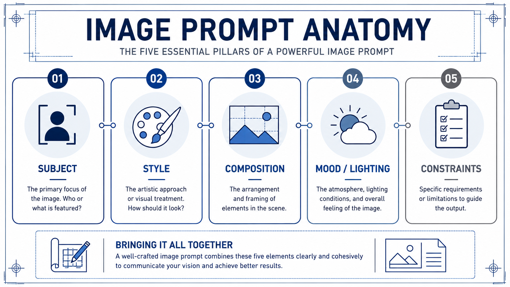
- Subject is what is literally shown: who or what is in the frame, doing what.
- Style is the visual treatment: photo, line illustration, 3D render, or a reference to your team's known look. This is where brand consistency lives.
- Composition is how the shot is framed: close-up or wide, eye-level or overhead, centered or off-axis, and crucially where the negative space sits for a slide title or headline.
- Mood/Lighting sets atmosphere: calm and focused, clean and optimistic, grounded and neutral.
- Constraints are the guardrails: aspect ratio (16:9 for a wide slide), exclusions (no readable text, no fake logos, no fabricated dashboards showing specific numbers or KPI figures, no clip-art "arrow going up" clichés), and any must-haves like a safe area for the title.
Run through all five every time, even when one feels obvious. "Obvious" is exactly where models default to the average — and average is off-brand, and for analytics decks it often means a fake chart full of numbers that read like real data.
Here's how the checklist works in practice. Milo, a design partner from internal comms, is helping an analyst turn a vague QBR idea into a usable prompt before opening the image tool:
- Milo: What's the subject?
- Analyst: Insights that move the business.
- Milo: That's a theme, not a subject — and "insights" is going to get you a glowing lightbulb over a laptop. Be specific. What's in the shot, where, doing what?
- Analyst: An over-the-shoulder view of one person at a clean workstation with abstract, unreadable data shapes on the screen, mid-focus, not posed.
- Milo: Better. Now style, composition, lighting, constraints. Skip any of those and you'll get the stock-photo version — plus we'll be fighting a fake dashboard with fake numbers and a title that won't sit anywhere.
Notice Milo's pressure isn't on creativity, it's on specificity. A vague subject equals a vague, off-brand, easily-fabricated-looking output.
Draft a Prompt from a Communication Goal 🥅
A prompt starts with the communication goal, not the image. Ask yourself: what does this image need to do, and where will it live? Anchor the opening slide of a QBR? Head the "Highlights" section of the monthly metrics report? Set a tone on the analytics-team wiki? The goal and the placement tell you the constraints before you touch subject or style.
Once you know the goal, translate the theme into a concrete scene. "Insights that move the business" is a theme, not a subject; a model may interpret a theme in many different ways. Push it into something you could photograph: an over-the-shoulder view of an analyst at a clean workstation, a small group at a screen showing abstract data shapes, close-up hands at a keyboard beside a notebook. Pick one. Then layer the other four anatomy elements on top, tuned to how your team's decks actually look.
Write the prompt as one block of clear sentences, not a list of tags. Something like: [Subject] a wide-angle photograph of one analyst at a clean, uncluttered workstation, viewed over the shoulder, with soft abstract data-flow shapes on the monitor rather than any readable chart; [Style] documentary-style; [Mood/Lighting] calm, focused natural light from the left, grounded and optimistic rather than staged; [Composition] 16:9 with clear empty space across the top third for a slide title; [Constraints] no readable text, fake company logos, fabricated dashboards with specific numbers or KPI figures, or clip-art "arrow going up" metaphors. That's all five elements, on purpose, on brand, in one paragraph.
Refine by Tightening Specificity and Exclusions 🔧
An initial batch may reveal revisions before it is ready to ship. Treat it as a diagnostic. Look at what's off and trace it back to an anatomy element. Faces look uncanny or airbrushed? Tighten Style ("documentary photo, natural skin texture") or add an exclusion ("no airbrushed faces, no warped hands"). The screen shows a fake chart with legible numbers? Add an exclusion for "no fabricated dashboards or readable KPI figures — abstract data shapes only." Image feels like generic stock? Subject is still too abstract. Title won't fit? You forgot a safe-area Constraint. Wrong shape for the slide? You skipped the aspect-ratio Constraint.
The move is targeted edits, not rewrites. Change one or two elements, regenerate, compare. Keep a short, reusable exclusions list you add every time (no readable text, no warped hands, no fake logos, no fabricated dashboards with specific numbers or KPI figures, no clip-art "arrow going up" clichés, no stereotypes), plus your standard aspect ratio and safe area for slides.
The throughline of this unit: a usable analytics image prompt is a deliberate set of five choices that match your team and your placement, not a wish. Vague in, generic out; specific and on-brand in, slide-ready out.
The test of any of this is whether it holds up live, so the next step is a conversation with a design partner where you'll walk through each anatomy element for a real QBR hero before you ever open the tool. Bring a concept that's already concrete, and expect to leave the call with it sharper, more on-brand, and free of clichés and fake charts.
