Prompting Image Generation Clearly
From Reading Images to Making Them 🎯
Reading images is one half of the job. The other half is making them. When you ask AI to generate an image, the model is guessing at thousands of choices you didn't make: where the camera sits, how abstract the scene is, what the color palette feels like, what fills the background behind your headline. Leave those choices to chance and you get a generic, vaguely-stock-render result that doesn't fit the demo deck, the proposal, or the solution-overview slide. Worse, in a customer-facing visual the model will happily invent a product screen you never asked for. This unit gives you a structure for making those choices on purpose.
Apply the Image Prompt Anatomy 🦴
The Image Prompt Anatomy is a five-part checklist for what to put into an image prompt: Subject, Style, Composition, Mood/Lighting, and Constraints. If any one is missing, the model fills the gap with whatever its training data suggests, which is usually a cliché.
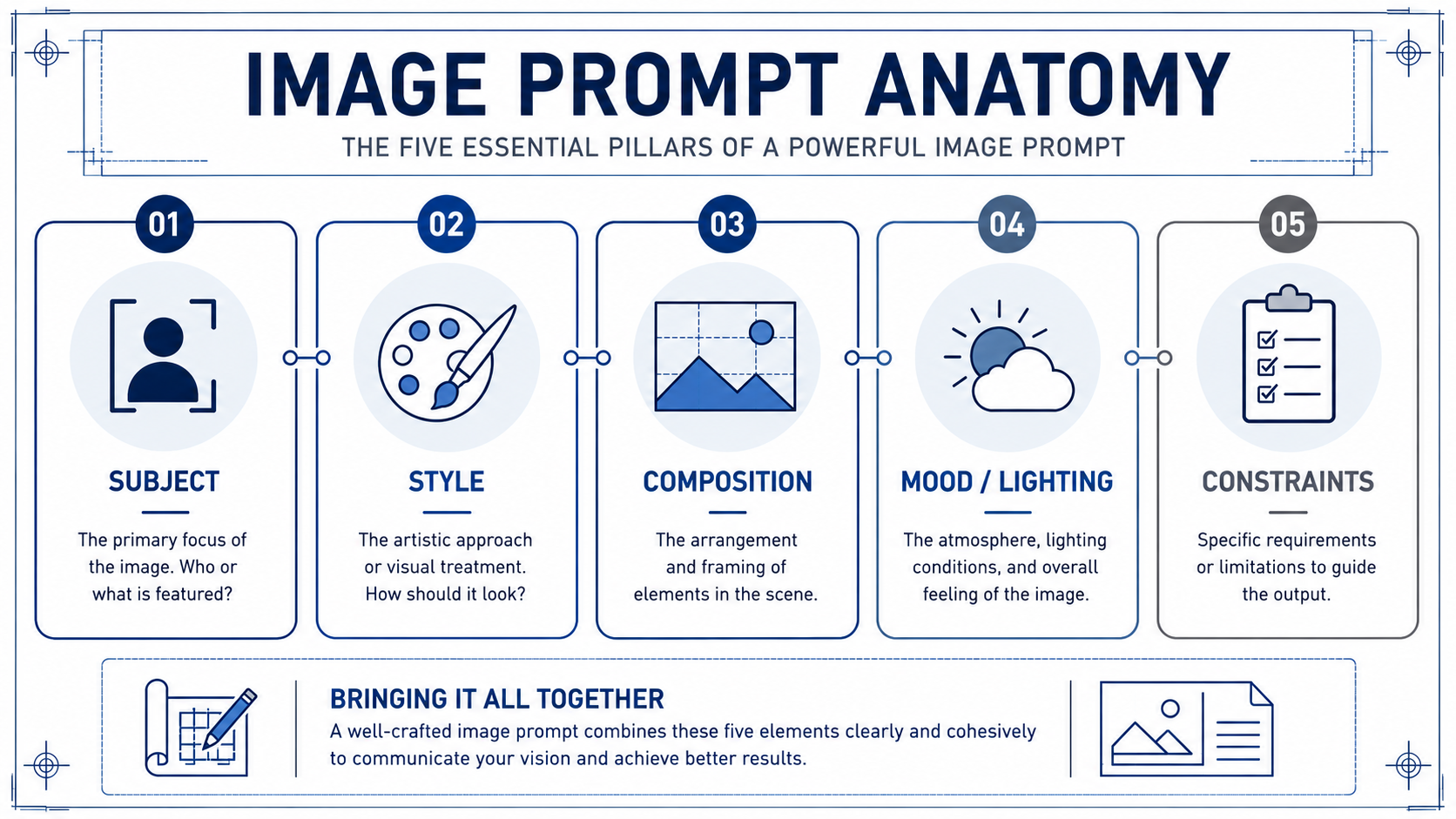
- Subject is what is literally shown: who or what is in the frame, doing what.
- Style is the visual treatment: photo, line illustration, 3D render, watercolor, or a reference to a known brand look.
- Composition is how the shot is framed: close-up or wide, eye-level or overhead, centered or off-axis, where the negative space sits.
- Mood/Lighting sets atmosphere: warm afternoon light, cool overcast, dramatic side-lighting, neutral studio.
- Constraints are the guardrails: aspect ratio (16:9 for slides, 1:1 for social), exclusions (no readable text, no fake logos, no fabricated product UI or invented metrics), and any "must include" or "must avoid" notes.
Run through all five every time, even when one feels obvious. "Obvious" is exactly where models default to the average.
Here's how the checklist works in practice. Milo is walking an SE through turning a vague demo-deck hero idea into a usable prompt before they open the image tool:
- Milo: What's the subject?
- Jordan: Our data platform, connected.
- Milo: That's a concept, not a subject. Be specific. What's actually in the frame?
- Jordan: Abstract nodes — a few source shapes feeding into one clean central hub, soft connecting lines, no literal chains or glowing padlocks, no fake dashboard.
- Milo: Better. Now: style, composition, lighting, constraints. Skip any of those and you'll get the stock-render version of your idea.
Notice Milo's pressure isn't on creativity, it's on specificity. Vague subject equals vague output.
Draft a Prompt from a Pre-Sales Goal 🥅
A prompt starts with the communication goal, not the image. Ask yourself: what does this image need to do for the customer in the room? Anchor a solution-overview slide? Set a confident tone behind your opening remarks? Carry a theme across a proposal? The goal tells you the constraints before you touch subject or style.
Once you know the goal, translate it into a concrete scene. "Your data, connected" is a theme, not a subject; a model can't draw a theme, and if you hand it the literal phrase you'll get glowing chains or a padlock. Push it into something you could render honestly: clean abstract nodes linking into a single hub, a calm modern workspace, light tracing a path between two shapes. Pick one. Then layer the other four anatomy elements on top — and keep it abstract enough that you're never implying a feature, screen, or result the product doesn't have.
Write the prompt as one block of clear sentences, not a list of tags. Something like: a wide-angle, minimal 3D render of several abstract data sources flowing into one connected hub, soft connecting lines, confident and modern; cool ambient light with a warm accent; muted brand-neutral tones; 16:9 aspect ratio with empty space on the upper left for the "Solution overview" headline; no readable text, no fake logos, no fabricated dashboards or product screens, no invented metrics, no literal chains. That's all five elements, on purpose, in one paragraph.
Refine by Tightening Specificity and Exclusions 🔧
Your first output will almost never be the one you ship. Treat it as a diagnostic. Look at what's off and trace it back to an anatomy element. Render looks generic? Subject is probably still too vague. Background a mess? Tighten Composition ("clean background, shallow depth of field"). It snuck in a chart-filled screen? That's a Constraints miss — add "no fabricated product UI, no dashboards, no numbers." Headline won't fit? You forgot a safe-area Constraint.
The move is targeted edits, not rewrites. Change one or two elements, regenerate, compare. Keep a short list of exclusions you find yourself adding every time (no readable text, no fake logos, no fabricated product UI or dashboards, no invented metrics implying capabilities the product lacks, no literal "connected" clichés), and reuse it as a baseline.
The throughline of this unit: a usable image prompt is a deliberate set of five choices, not a wish. Vague in, generic out; specific in, demo-ready out.
The test of any of this is whether it holds up live, so the next step is a conversation with a design partner where you'll walk through each anatomy element for a real demo-deck hero image before you ever open the tool. Bring a concept that's already concrete, and expect to leave the call with it sharper.
Summary
This lesson introduces the Image Prompt Anatomy, a five-part framework for creating specific, professional visuals. You will learn how to translate abstract pre-sales communication goals into concrete scenes and layer details like style, composition, and constraints to avoid generic — or misleading — results. By mastering this structured approach, you can move from vague requests to high-quality, honest, customer-facing images through deliberate drafting and iterative refinement.
