Progress Tracking and Transparency
Progress Tracking and Transparency
After mastering flexible roadmapping and managing changing expectations, you now face the critical challenge of making progress visible and building trust through transparency. In agile environments, transparency isn't just about sharing information—it's about creating shared understanding that enables better decisions and stronger stakeholder relationships. Traditional status reporting often obscures reality behind green-yellow-red dashboards and percentage-complete metrics that create false comfort until projects suddenly go off the rails. Instead, you’ll learn to create information radiators that make work visible, use visual tools that reveal true project dynamics, and practice radical transparency that shares reality—including uncertainties, impediments, and risks—in ways that invite collaboration rather than trigger panic. This creates accountability not through surveillance but through shared visibility into actual progress and challenges, shifting conversations from "What's the real status?" to "How can we help solve this impediment?" and turning transparency—though initially uncomfortable—into your most powerful tool for building trust and enabling organizational agility.
Creating Information Radiators for Stakeholder Visibility
Information radiators broadcast project status so clearly that anyone walking by—physically or virtually—immediately understands current state without needing explanation. Unlike traditional reports buried in email or hidden in project folders, radiators make information impossible to ignore, creating ambient awareness that keeps everyone aligned without constant status meetings. The principle is simple: if stakeholders have to ask for status, your transparency isn't working.
Physical team rooms once featured wall-mounted task boards, burndown charts, and printed dashboards; in today’s distributed world, you create digital radiators that serve the same purpose through dashboard monitors, automated Slack updates, live wikis, or team portals. The key isn’t the tool but making information highly visible and immediately comprehensible so stakeholders never need to ask for basic status.
Effective radiators are self-explanatory, show current state (answering “Where are we now?”), and are actionable, highlighting what needs attention rather than just documenting activity. Start with your team board as the primary radiator, showing work moving from To Do → In Progress → Review → Done, with swim lanes and color-coding (red blockers, yellow aging items, green on-track work). Add a simple metrics dashboard with instantly readable indicators like "Current Sprint: 7 of 13 items complete", "Days until release: 18", "Outstanding blockers: 3" kept up to date automatically.
Give special focus to an impediment board that surfaces problems as visible, ownable challenges—each impediment listed with age, impact, and owner—so patterns and systemic issues emerge. For distributed teams, extend these concepts into virtual radiators (persistent video of boards, automated snapshots, live dashboards) to create ambient awareness where stakeholders absorb project state through casual observation, shifting from push-reporting to pull-visibility that reduces anxiety and increases genuine engagement.
Using Visual Charts and Metrics Effectively
Visual charts transform abstract progress into concrete understanding, but only when used appropriately. Burndown and burnup charts, the workhorses of agile visualization, tell different stories and serve different purposes. Burndowns show work remaining, creating urgency as the line must reach zero by sprint end. Burnups show work completed against a target line, making scope changes visible as movements in the target rather than mysterious bumps in remaining work. Understanding when to use each—and how to interpret what they reveal—separates effective transparency from misleading visualization.
| Aspect | Sprint Burndown | Release Burnup |
|---|---|---|
| What it shows | Work remaining over the sprint | Work completed over time, plus a total scope (target) line |
| Primary purpose | Drive day-to-day sprint execution and focus | Provide release-level visibility and progress vs target |
| Time horizon | One sprint (days) | Multiple sprints / release window (weeks–months) |
| “On track” signal | Line trends to zero by sprint end | Completed-work line trends to meet/cross the target line by the desired date |
| How it handles scope changes | Poorly: added work makes the line jump up; removed work makes it drop—can erase visible progress or mask issues | Well: scope changes move the target line while completed work stays visible—scope growth is explicit |
| Best audience | Team (execution focus) | Stakeholders + team (planning and expectation management) |
| Common interpretation clues | Flat line = stalled/blocked work; sharp drop = batch completion or delayed testing | Completed line slope = delivery rate; target line moving = scope churn impacting date |
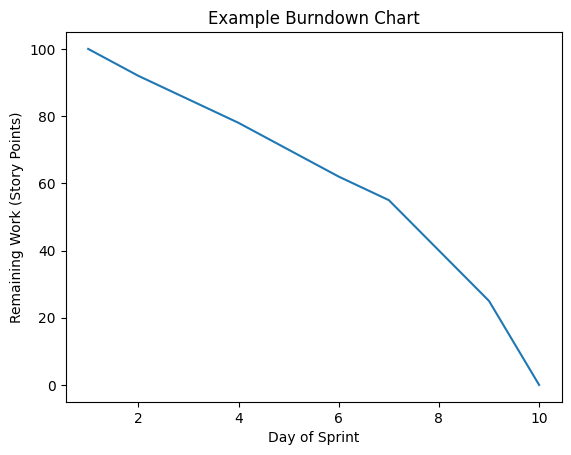
.png)
The burndown chart creates sprint focus by showing daily whether the team is on track to complete its commitment. A flattening line signals stalled work (blocks or complexity), while a sharp drop suggests multiple items finished at once (batching or delayed testing). Its main weakness is scope change: adding work makes the line jump up, erasing visible progress, and removing work makes it drop artificially, masking velocity issues.
Burnup charts give better transparency over longer horizons and changing scope. They plot two lines: work completed rising over time and total scope as a target line. When scope increases, the target line moves up without affecting the completed-work line, making it clear that delays come from added scope, not slower teams—like when a Product Manager showed executives that constant velocity plus 40% scope growth made the original date impossible.
Consider how different charts reveal different truths about the same project. A burndown showing erratic progress might indicate an unstable team, but the corresponding burnup might reveal constant velocity with frequent scope changes—a very different problem requiring different solutions. This is why combining visualizations provides the complete picture. Show the sprint burndown for team focus alongside a release burnup for stakeholder visibility, using each tool where it excels.
Throughput metrics and percentile analysis go deeper than traditional velocity by tracking the distribution of completed work (for example, 50th percentile = 23, 85th = 28, 95th = 31 over 10 sprints). This shows consistency and supports realistic commitments—so when asked “How much can you deliver?” you can answer, “With 85% confidence, 28 points or less”, acknowledging variability while still giving actionable planning information.
Use cumulative flow diagrams and other charts to answer specific questions instead of showing every metric. CFD bands reveal bottlenecks (widening “In Review”), smooth flow (parallel bands), and systemic issues (shrinking “Ready for Development”), while burndowns help sprint execution and burnups support release planning. Above all, teach stakeholders how to read these visualizations, so patterns translate into appropriate actions and stakeholders become informed partners rather than confused observers.
Building Trust Through Radical Transparency
Radical transparency—sharing everything, including uncertainties, failures, and bad news—can feel risky but ultimately builds unshakeable stakeholder trust. It requires reframing information sharing from controlling perceptions to treating information as a shared resource, so everyone sees the same reality instead of playing telephone with partial truths. Start with proactive communication about problems before they become crises: share risks early, add context and options, and invite collaboration (for example, explaining a complex API integration, its likely impact, and possible responses). When you consistently share reality this way, stakeholders stop wondering what you’re hiding and start focusing on how to help, becoming powerful allies when challenges hit.
Let's observe how radical transparency transforms a difficult conversation between Ryan, a product manager, and Nova, an executive:
- Ryan:
"I need to share something concerning. Our velocity has dropped 30% over the last two sprints, and we're going to miss the April milestone."- Nova:
"I appreciate you telling me now rather than surprising me in April. What's causing the drop?"- Ryan:
"Two factors: the technical debt we've been deferring is now blocking new features, and we underestimated the complexity of the payment integration."- Nova:
"What do you need from me?"- Ryan:
"Two things: approval to spend one full sprint on technical debt, and budget for a payment specialist consultant for two weeks."- Nova:
"Done. Your transparency gives me confidence you're managing this properly. Keep me updated weekly."
Notice how transparency shifts the conversation from blame to problem-solving. The executive appreciates early warning and responds with support rather than criticism because the product manager presented problems with context and solutions.
Create regular cadences for transparent communication—weekly updates with a “Concerns and Risks” section, sprint reviews that show failures as well as successes, and monthly metrics reviews that include negative trends—so transparency becomes systematic, not exceptional. Pair this with sharing uncertainty instead of false precision: communicate confidence levels, make assumptions explicit, and openly acknowledge unknowns. This honesty, sustained over time, builds deep trust: stakeholders feel they’re seeing the full picture, become partners in problem-solving rather than judges, and are more likely to support, defend, and help your team when inevitable challenges arise.
Lesson Recap
In this lesson, you learned how to make progress visible and trustworthy by creating clear information radiators (team boards, metrics dashboards, impediment boards, and virtual radiators) that show current, actionable status without constant reporting; how to use visual metrics and charts (burndown, burnup, cumulative flow, throughput and percentile analysis) to reveal true delivery patterns, bottlenecks, and the impact of scope changes; and how to build deep stakeholder trust through radical transparency—sharing risks, uncertainties, bad news, confidence levels, and assumptions early and routinely through regular communication cadences, turning stakeholders into informed partners in problem-solving rather than anxious status-seekers.
Now you're ready to practice creating information radiators, interpreting visual metrics, and communicating with radical transparency through hands-on exercises that will solidify these critical skills.
