Welcome to the next lesson about curve fitting, a crucial technique used in data analysis to model relationships between variables. In our previous lessons, you've learned how to use SciPy to perform curve fitting with linear, quadratic and exponential models. As you continue your journey, it's important to understand the role of initial guesses in the curve fitting process. Initial guesses are starting values for parameters that the fitting algorithm uses to find the best-fit curve. These guesses can significantly influence the success of the fitting process.
Our focus in this lesson is on fitting a cosine model, which is widely used in modeling periodic data. Let's understand the components of a cosine model through an example.
Here's a simple definition of a cosine model function:
- Amplitude: Determines the height of the wave. Think of it as how tall the peaks of your wave are.
- Frequency: Determines how many cycles occur within a specified interval. A higher frequency means more waves.
- Phase: Shifts the wave horizontally. It moves the wave left or right.
- Offset: Moves the wave vertically. It determines how the wave is centered.
This function forms the backbone of our curve fitting exercise, allowing us to model periodic behavior present in data.
Creating synthetic data helps simulate real-world data for testing our model. Let’s generate some periodic data using numpy and visualize it with matplotlib.
np.linspace(0, 4 * np.pi, num=50)generates 50 evenly spaced points between0and4π, representing our x-values.3 * np.cos(1.5 * x_data + 0.5) + 1models a cosine wave with an amplitude of 3, a frequency of 1.5, a phase shift of 0.5, and a vertical offset of 1.np.random.normal(scale=0.5, size=x_data.size)adds random noise to simulate natural data variability.
Here is how we can visualize this data:

This visualization helps us see the general pattern of our data, with noise added to reflect real-world imperfections.
Choosing good initial guesses can help the fitting process converge to the optimal solution. Let’s discuss this through our cosine model example.
We start with a poor initial guess for the parameters:
- The fitting algorithm refines these initial guesses to minimize the difference between the model and actual data.
- If our initial guesses are far from the true parameters, the optimizer may struggle or fail to find the best fit.
- In this case, the initial guess is poor, because it assumes the amplitude and frequency are zeros, which turns the cosine models into a simple linear
offset.
Let's proceed to fit our data to the cosine model using SciPy's curve_fit function.
The result will be:

As you can see, a poorly chosen initial guess led to an incorrect curve.
Let's increase amplitude and frequency. For instance, we can define our initial guess as:
In this case, the result might look like this:

It is not easy to interpret what went wrong. However, in this particular case, it seems that the frequency is too big, resulting in an incorrect curve.
Finally, let's define a new initial guess with a moderate frequency:
Here is the resulting curve for this one:
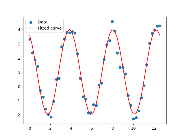
Now, the curve accurately models the data. This shows the importance of choosing a proper initial guess.
Before fitting the model, it's beneficial to visualize the initial guess to assess whether it aligns closely with the data. This step can provide insights on whether the initial parameters are reasonable.
Here's how to plot the initial guess over the synthetic data:
This plot displays both the synthetic data and the curve generated using the initial guess. Comparing them can help determine if the initial guess is a good starting point for the fitting algorithm. A curve that closely follows the data pattern suggests a better chance for a successful fitting process. Let's visualize our best initial guess this way:

By analyzing this plot, we can see how the initial guess has close frequency but inaccurate amplitude. We can use this plot to further tune initial guess in order to make the final fitting result as good as possible.
In this lesson, you learned about the significant impact of initial guesses on the curve fitting process. Understanding and experimenting with initial guesses can greatly influence the success of model fitting, helping you achieve better results in real-world data analysis.
Next, you'll practice applying these concepts, experimenting with initial guesses and observing how they affect the fitting results. Remember, refining your skills with different scenarios will build your confidence and expertise in curve fitting. Well done on reaching this point in the course!
